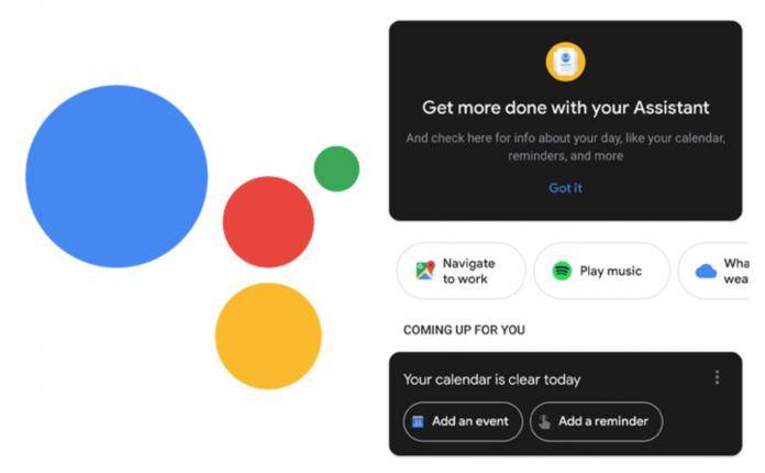
While people are indeed demanding for dark modes from their OEMs and app developers, they probably were not asking for some half-baked looking update just so they can say “hey, we got you a dark mode!” And while Google has been slowly bringing that dark mode option to some of their apps, this time around, it’s not something to write home about. The Google Assistant cards with dark themes do not look good at all and we’re hoping that this is just an initial test that they’re rolling out.
The point of having a dark mode option is to eliminate the whites so if you’re browsing in the dark or if you want to lessen the strain on your eyes, you can just switch to this less bright mode. But the Google Assistant UI cards is more of a black-on-white mode rather than a dark mode with white background, defeating the purpose of having the dark mode in the first place.
If this was just a beta test (and we’re still hoping that it is), then they are rolling it out to quite a huge number of users. Obviously, it is not getting good feedback as it looks like someone made a mistake and pushed a button without having finalized the actual coding. If that’s the case then someone is probably getting fired over this as it doesn’t seem very Google-ish.
The dark mode cards were supposedly part of a bigger Google Assistant update which puts the cards in the bottom bar interface, among other things. Let’s hope they are able to make it better upon the next update or they just pull this out altogether before the clamor to bring back the original blinding white cards become louder.
VIA: Android Police


