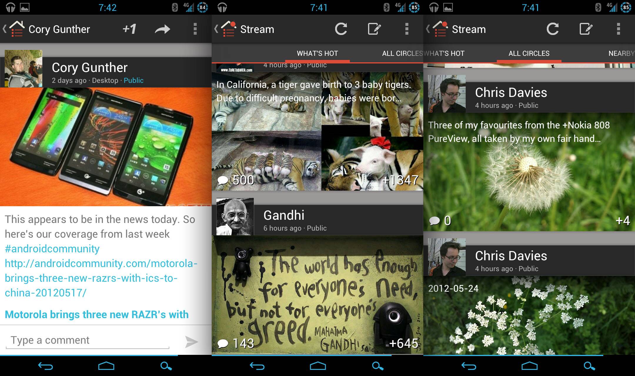
The Google+ team seems to be finished for iOS for the moment, hand has once again turned its attention on the Android faithful. The native asocial networking app gets a major facelift on Android today, incorporating a new UI that’s very heavy on images – even allowing you to download them directly from posts, as in a web browser. Unfortunately, the long-awaited tablet app is nowhere to be seen.
The interface is certainly more attractive, if somewhat dismissive of the actual text and comments on a particular G+ post. The experience is something like Flipboard for a social network. Even without a tablet app, it’s a notably faster and more aesthetically pleasing experience than the native clients for Twitter or Facebook. The old icon-based homepage has been condensed into a collapsing sidebar, not unlike the latest version of Spotify.
Other new features include the ability to initiate a Google+ hangout directly from the main menu, a ringtone/alert option for new hangouts, suggestions for people who may be in your real life social circles, and (yes!) editing posts from the mobile client. The redesign takes some getting used to – if you’re more of a fan of textual interfaces, then the updated app probably won’t appeal. That said, the vast majority of early responses seem positive. While you’re there, why not add Android Community to your circles?


Don’t quote me on this, but the Google+ app seems to be more social and better than the Facebook and Twitter apps I have.
The lack of tablet support should have been in your headlines. It’s your job as a journalist to call you and bust some balls at the G+ team.
Google promised us something that the iOS apps wouldn’t have. What is it?
Definitely prefer the new app to any other social network I’ve used, but I miss the home screen. I actually really like the new iOS home screen for G+. As it is, it feels really cluttered and I don’t know where to go when I launch the app. Kinda feels overwhelming as is.