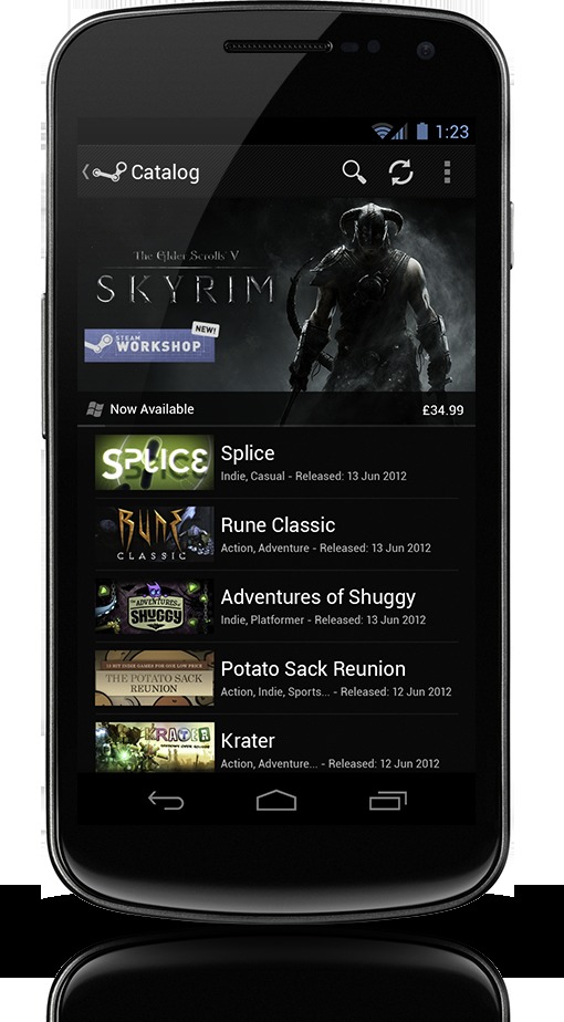
Today I was tipped about an awesome fan made version of Steam for Android. In case you didn’t know, yes Steam has an Android app to make sure you can follow your gamer friends, and never miss one of their big sales. While this fans design is awesome, I’d have to say this is how a lot more apps should look — not just Steam.
More details on Steam for Android can be found by clicking here. A friend tipped me about a thread over at the always popular Reddit, showing off how he thinks Steam “should” have looked. It follows along with Android (specifically 4.0 ICS) design elements, has HD image artwork, and high resolution textures. These are all things missing from Steam’s original app. The images are tiny, blurry, and the design is a complete mess. He calls it a “sin” and we’d have to agree. This brings me to a bigger thought though. This isn’t just how Steam should have looked, this is how tons and tons of apps should look but don’t.
To be honest I actually wouldn’t mind his design for the actual Google Play Store either. Sure the new design is nice, but his is sleek, simple, and clean. So what do you guys think. Does the Steam for Android look and work good, or could it use an overhaul? Since being announced and getting a few quick updates it has been pretty quiet. Do you even use Steam for Android, or would you use it if it looked like this?
Android 4.0 Ice Cream Sandwich has been available for more than a few months and while many phones still aren’t on the latest OS from Google, many will be in the future. Hopefully developers start building their apps tailored around Android 4.0 Ice Cream Sandwich design elements. Oh and someone should hire this guy.
[via Reddit]


