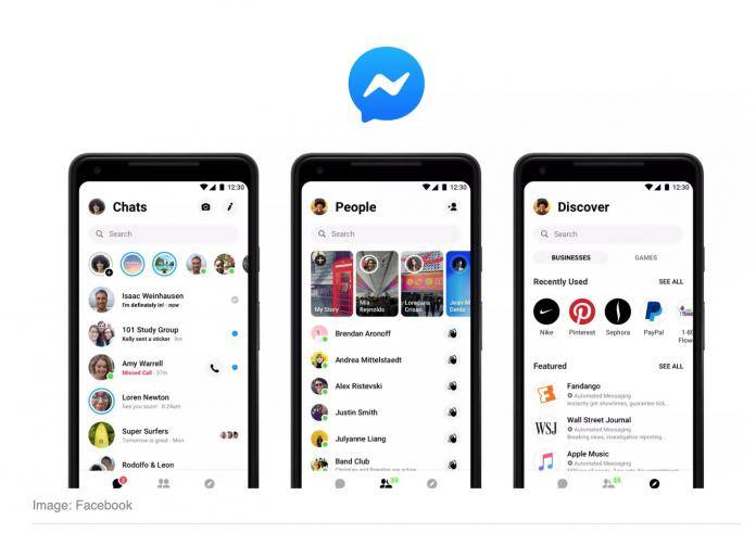
It’s been 8 months since Facebook initially announced that they were redesigning their Messenger app during the F8 developers’ conference but the roll-out has been pretty slow. Now they’re finally bringing it to a wider audience as the update is now available on the Google Play Store. However, they say that it might take a little more time before everyone actually gets it, which can be good news or bad news, depending on what you think of the supposedly more minimalist design.
The redesign actually intends to simplify how Messenger looks like so you’ll be able to quickly access the features that you need. If before you had 9 tabs to choose from when you initially open your app, you now will only have 3 tabs at the bottom: one for chats, one for your contacts, and one for the games or chatbots. All of the other features are still there but just hidden under sub-menus in a new four-dot icon.
The Messenger app also now has a lot of more clean-looking whitespace which is good if you like that minimalist look but bad news for your battery. However, you don’t have dark mode option just yet even though they did mention it during the F8 conference last May. They did mention that it will be part of a phased rollout “in the near future” but if it’s following the schedule of the initial update, then don’t hold your breath.
Reaction to the update has been pretty negative, but that’s just par for the course every time Facebook brings out something new. Some were just confused with the new layout while others were just complaining that the previous look was good enough and why were they fixing something that wasn’t broken.
VIA: The Verge


