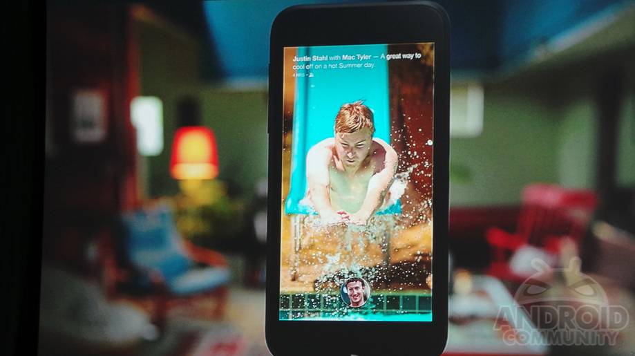
After all the waiting and speculation we can finally put the rumors and leaks to rest. This morning Facebook has just kicked off their “New home on Android” event and essentially announced what we knew was coming. With plenty of leaks we had a good idea but now it’s official. It’s called Facebook Home and will be a replacement for your standard Android home screen laden with news feeds and Facebook galore.
We’ll be filling out all the details as things get announced, but so far this looks to be pretty promising and lines up perfectly with previous leaks from the past 7-10 days. Just like we mentioned earlier in the week, this is how Android gets social to the core – even if we (or you) don’t want it to. Android will be present for the most part, but completely covered in Facebook’s own home screen replacement app, or launcher, and it looks pretty interesting.
Facebook Home will be delivering the content you need the most, depending on your priorities, along with everything else like weather, missed calls, incoming messages, news and more all to one easy to use and view feed. It’s now called the Cover Feed, not the news feed. The important part here will be how it categorizes what’s most important, and what gets delivered to your eyes first. We’ve seen many enjoy and use Flipboard. HTC’s Blinkfeed home screen widget does something similar, and now the number one social network in the world will be doing the same.
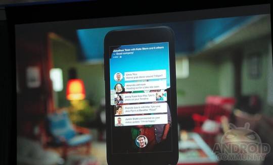
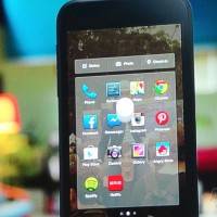
Essentially Facebook home is a giant always-on widget that will constantly give you updates on anything and everything. As you see in the above pictures all you get on waking up your device you’re instantly connected. Little circle of your face (profile picture) the time, and then the Cover Feed full of information. You can swipe to scroll through them, double click to like, and much more.
This is a dramatic shift in everything we know and love about Facebook. While some standard apps are stock Android in look, the entire feel of the device is 100% different. Everything is fullscreen, all navigation is done through a selection of swipes. This is essentially a complete fork of Android – even though it isn’t. Facebook’s made essentially a launcher that goes beyond most available in the Play Store. Facebook is still busy showing all of this off as we speak, so stay tuned for all the details. Below are a few more photos for an idea of what to expect. Stay tuned to our Facebook Portal for all the news.





Doesn’t sound like a fork at all. Just a crappy launcher.