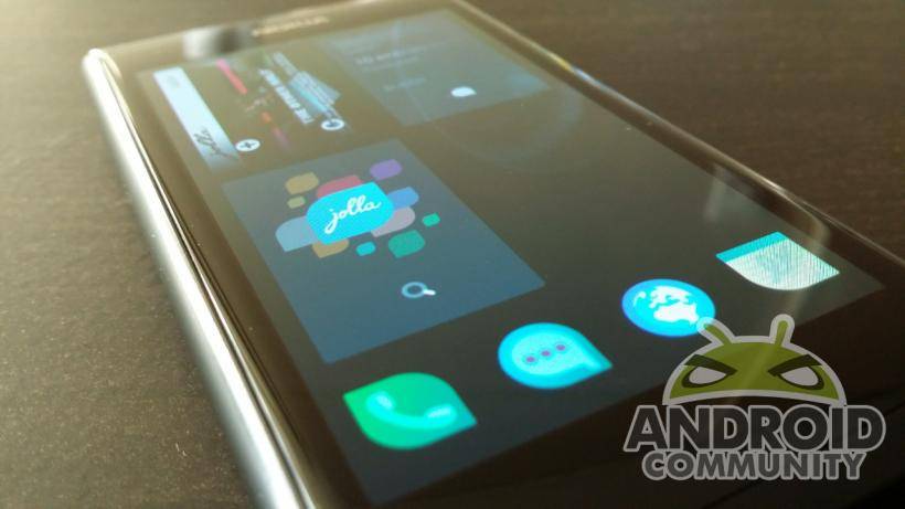
When Finnish company Jolla tried to fulfill its promise of bringing forth a smartphone unlike any other, it didn’t exactly make a big splash. Nonetheless, it is still continuing to send ripples that are now reaching Android shores. Here we take a peek at what more adventurous users might soon see on their home screen or even on their device itself.
Testing the waters
But first a big disclaimer. The photos and examples you will see are based on a rather aging, about four months old, version of Sailfish OS that was made to run on a Nokia N9. Given the history of the platform, that is quite fitting. Nonetheless, it is not exactly similar to an actual Sailfish OS experience when running on a Jolla smartphone but comes close enough to see the philosophy, design, and quirks of this mobile platform.
If you managed to survive the aquatic puns above, you might begin to wonder why bother with this non-Android OS at all. The first answer is more proximate: Jolla has just recently released a preview of Sailfish OS for Android devices, particularly the Nexus 4. Soon it will be on the Samsung Galaxy S III as well. Think of it as a possible alternative ROM for some Android devices. Secondly, Jolla has already made it known that it intends to bring the Jolla experience to Android, possibly via a launcher. And finally, the Sailfish OS interface has a particular flavor to it. Given the number of swipe-based launchers or utilities in Android, there is definitely some interest in that kind of interaction.
Taking a swipe at Sailfish OS
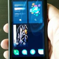
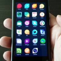
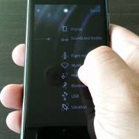
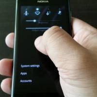
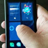
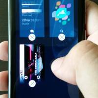
Swiping is the bread and butter of Sailfish OS. It takes its inspiration from its distant predecessor, the MeeGo Harmattan OS running on the Nokia N9 (now you know why it was fitting). But Sailfish takes that to an extreme, with every side and every native Sailfish app employing the gesture in place of screen-cluttering menus and buttons. When you wake up the screen, you are greeted by a rather plain lockscreen showing you the time and network status. Swipe down and you get quick access to important actions like muting the phone, launching the phone or camera apps, or getting to the system settings. If you swiped the other direction you would have landed on the “currently running apps” screen along with the quick launch panel with your four favorite apps. Another swipe up and you get to that all familiar app grid.
Yes, everything is a swipe away. And not just from the homescreen but also within apps themselves. Android also employs multiple pages of screens in a single app. But whereas Android makes use of the back button or other navigation buttons to walk through them, Sailfish uses, you guessed it, swiping. Swiping to the right takes you back to the previous page. Swiping to the left, however, depends on the app. It might take you to some special page or it might initiate an action. Either way, there are indicators in the top right and left sides of the screen that give a clue to what’s in store, though it’s not always obvious. Swiping down in most apps reveals what Jolla calls the “pulley menu”. Basically it’s just a menu that is controlled via a continuous swiping gesture, releasing the finger only when the correct menu action has been highlighted.
Be careful though. Swiping from the edges, especially when inside an app, has different behaviors. Swiping from the left or right edge of the screen gives access to the notification screen, pretty much the same function as Android drop down notification panel. Swiping from the side again returns to the previous app. Swiping from the bottom of the screen minimizes the current app and shows you the currently running apps. Swiping from the top edge is a shortcut to closing the app. In the world of Sailfish, MeeGo and its kin, users do have to mind the apps that they have left running.
Sailing away
An almost completely swipe-based system like Sailfish has some benefits, and of course some drawbacks. Hiding actions and menus behind swipes frees up a good amount of screen space, revealing them only when and if you need them. This isn’t entirely unheard of. This is practically how Microsoft designed a lot of interactions in Windows 8. Closer to home, a lot of Android apps, implement reading modes that drives away the chrome (the geeky way to call tabs, menus, and buttons) and only calls them back at your command. Some, however, would label this kind of user interface as unintuitive. This author subscribes to the school of thought that says no user interface is ultimately intuitive. They just have to be easily learnable or at least easily discoverable. Consistency is key.
Swiping, at least as implemented by Sailfish OS does drag along some practical and physiological issues. Swiping requires more muscle movement and dexterity than would otherwise be required by tapping, especially when using only one hand. The pulley menu is fun the first few times but can be tiring after a while. You might soon experience some pain along your thumb if you’re not too careful. Another consideration is that having gestures on all edges of the device requires you to have a small device. Sailfish OS, as it is, will not be that easy to use on a phablet. In a way, Jolla could have signed its own fate, tying itself to that current size. Then again, it won’t be alone since Apple has practically limited its iPhones to small sizes as well.
Wrap-Up
If Jolla ever makes true its plan to have a Sailfish homescreen on Android, it will most likely not have everything described above. For one, Android apps can’t simply change the way they behave. And even on the home screen itself, there will be limits. While a third-party homescreen can display a list of current or recent apps, closing them will require certain system-level access, as the OmniROM team described when they announced OmniSwitch.
A swipe-based interface offers many benefits, but those don’t come without costs. It clears up the screen to make room for more content at the price of some learning curve. A Sailfish Android launcher could potentially give users access to an app grid, most recent apps, notifications, and more, all from a single swipe, whether they are in the homescreen or in an app. In fact, some launchers and utilities provide these as well, though in bits and pieces. And that is one of the greatest things about Android. Even if Jolla never brings a swipe-based launcher like Sailfish to Android, someone else inevitably will, and maybe come up with something better.






Been running it myself and when they fix calls and let me have an app store on there I will go back to it.