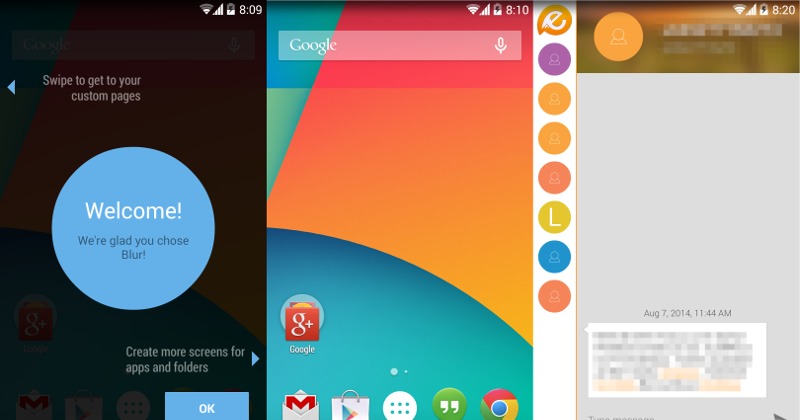
Google Now Launcher (or Google Experience Launcher, if you prefer the older name) is seemingly becoming the new fad for homescreen launchers. After CyanogenMod’s own spin on the launcher with its CM Home experiment, Klinker Apps, makers of EvolveSMS and Talon, are now making available a new launcher called Blur that expands Google’s launcher to make room for third-party developers to join the party.
What makes the GNL/GEL special? In the context of Google Now, it makes Google’s context-based smart assistant easily accessible with a swipe gesture from the homescreen, dedicating the leftmost page to Google Now. Developers have taken inspiration from that concept and put their own twist by displacing Google Now, or at least making it optional, and leaving that space open for third party apps and widgets, or cards in Google Now parlance. In a nutshell, this is what Blur Launcher does but it also goes the extra mile by providing an API for other developers to hook into, making the possibilities potentially endless.
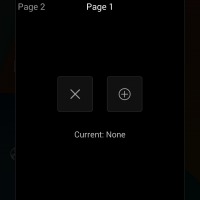
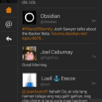
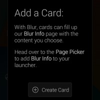
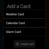
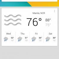
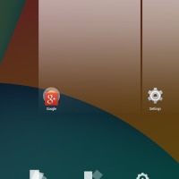
Coming from Google Now Launcher, which itself is a modification of the AOSP Launcher, every feature is hidden behind the settings option, revealed with a tap and hold gesture on the homescreen. From there, you can choose which app will be embedded in that special Page. One of the limitations of GNL, which CM Home seems to have chosen to inherit, is that there is room for only one such special page. Blur, on the other hand, gives you up to 5 pages if you want. To get the ball rolling, Klinker provides a page for EvolveSMS and Talon for Twitter, the latter requires a separate add-on to be installed. But there is sort of a way around this “one app” limitation. Blur offers an Info Page, which is a Google Now-like implementation, with a Google Search bar on top and space for cards. Unlike Google Now, however, those cards aren’t dynamic and context-based and you will have to choose which cards you want to appear there. You can also move rearrange them as you please. At the moment though, it seems that only the Weather card is working.
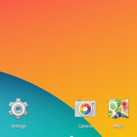
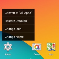
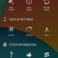
But beyond this fancy Page implementation, Blur also offers features that can’t be found in GNL or AOSP Launcher that puts it on par with older and more featured Android homescreen replacements. You can, for example, choose the size of both the homescreen and the all apps grid. You can even choose the number of apps allowed on the dock, up to 9 max (the All Apps icon is counted as one). Scrolling effects, icon packs, and gestures are all accounted for. There is even an option for hidden apps and for locking the homescreen icons in place. One note to be aware of, unread badges are not built-in, meaning you won’t be able to see the number of unread messages or emails on app icons unless you install and enable and experimental add-on, which requires Android 4.3 or higher. There is even “OK, Google” hotword detection, noted to work only for Android KitKat and later version.
Blur Launcher is definitely an interesting take on an Android Launcher that offers both the simplicity of GNL/AOSP Launcher with the power of third-party pages and cards. Right now, however, the extremely limited choices of those pages and cards make Blur a little less useful. But with an open API, the launcher has the potential to grow exponentially. All it needs now is for app developers to answer its call.
Download: Blur, Blur – Unread, Talon (Blur) on Google Play Store
SOURCE: +Luke Klinker (1), (2)





So how do I become a Deeev?