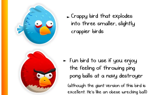
Do you know about The Oatmeal? They’re a pretty awesome group of folks who make illustrations and have an awesome, awesome blog. Occasionally they post something rather relevant to Android, like this Angry Birds infographic, and we just cannot resist. Take a peek at the first bit here, then go down the scale to the least likable birds in the pack. Can you guess which ones they are?
I’d have to say that this is basically the most accurate chart about the likability of Angry Birds that I’ve ever seen. From top to bottom, with the exception of that red bird, who I just cannot believe continues to come up later in the game, even fat, and think should be at the bottom of the chart, this chart is great. I must mention though that I don’t speak for everyone on our team, each person in the Android Community is of course an individual, and since this topic is an important one, I’ll leave it up to them to decide on their ideal chart.

Now you might notice the lack of a couple of birds on this chart. That is because we’ve left the tail end off as it is so common that someone will take a “The Oatmeal” chart in its entirety without linking back. In this case, we’ve decided to be incredibly noble and leave the last bit to them to display right over [here].
[via The Oatmeal]


Oatmeal is just one guy.
oatmeal is delicious