Well, we reported this morning that iOS smash-hit newsreader Flipboard would be entering beta soon, catering to specific handsets in order for the developer to get used to multiple screen resolutions. Well we were only half right, but we were half right really fast, so I’m going to call it a win. All interested parties can now download the Flipboard beta APK from their website, and navigate the news with aplomb using RSS feeds, social networking and gestures. Which is what we did, rather promptly, for your enjoyment.
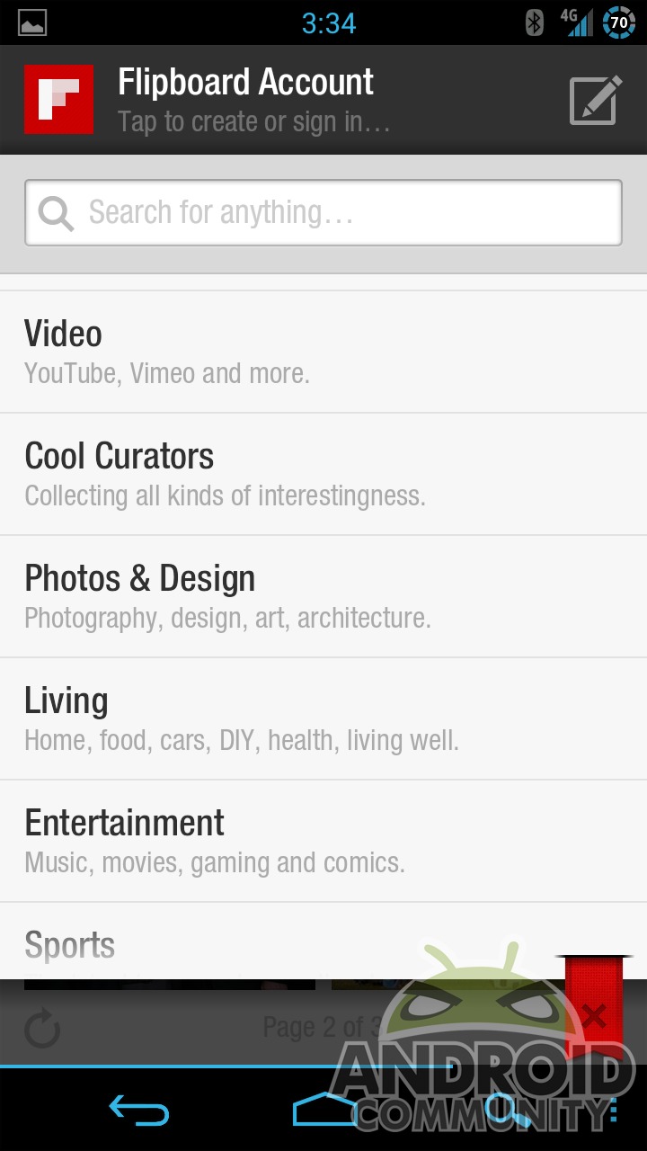
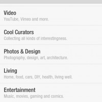
Flipboard is your standard RSS-style newsreader with both cherry-picked content inassigned categories and a search function that lets you bring in feeds from your favorite websites (like Android Community, SlashGear and My Little Pony Arena – no, really). In addition you can add your Facebook and Twitter accounts to see your social updates in the same app, albeit somewhat separated.
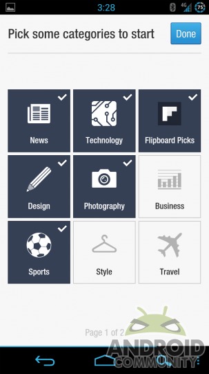
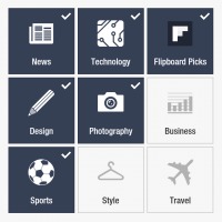
Navigation is fairly unique. After picking and choosing your topics or alternately creating a Flipboard account and saving them to the cloud, you can either tap on a featured story or select one of your topics. From there you navigate the stories one step lower with an up and down gesture which triggers a nifty animation, not unlike an old-school digital alarm clock. Tap on the story and you’re treated to a traditional column view, and depending upon the formatting it’s also separated into pages with the “flip” motion. Though the app is technically in beta, it seems rock-solid on my rooted Galaxy Nexus.
The interface is heavily visual: it’s rare that you’ll see a page or screen that’s all text. Even the settings and search functions place heavy value on the visual element. More vertically oriented photos will take up an entire page in a pleasing bit of visual flair. If that’s your cup of tea, great – but I found it somewhat disheartening to use a limited, one-at-a-time interface on a device with a relatively huge, high-resolution screen.
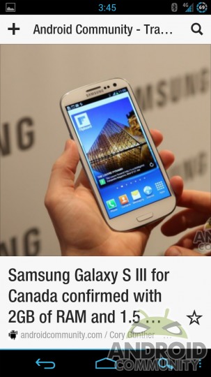
As far as technical achievement goes, there’s not a whole lot to Flipboard that you haven’t seen already in other news aggregation apps, like Google Currents or Pulse. The differences are exactly two: Flipboard is a lot prettier and a lot more focused. And by focused, I mean extremely focused: you can only see one story at a time after the front page, making quick browsing a rather tedious process. It’s also limited to portrait view, which in this day and age is a bit maddening.
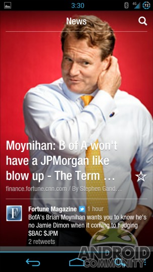
All in all, Flipboard suffers from the same symptoms that a lot of popular iOS converts do: limited functionality via a limited scope. I’d love to see an Android version of the original iPad app, which takes advantage of the large screen real estate to delivery a truly magazine-style experience. In its smartphone form, Flipboard is a very polished app, but the mechanism for getting through your news or social events is frustratingly slow. I can honestly say that TweetDeck (which is a long way from perfect itself) lets me see more information, more quickly, in a form that’s easy to sift through and navigate.
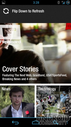
But hey, at least they’ve got a widget, which is more than I can say for most iOS converts. I eagerly await the Android tablet version. In the meantime, check out Chris Burns’ hands-on video below:









There is no widget with flipboard. I’m not sure where that option even came from or why it was even posted
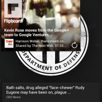
There is with this version. See the gallery.
Regardless I’ve since deleted flipboard. Its an ok app but I find myself using other apps like twitter and facebook but now that I know it has a widget I might just go back to it
You must be thinking of the iOS version.
The one for Android certainly has widgets.
Both this one and the one that leaked from the SGS3 a few weeks ago.
There’s no link to download, I just get a signup page…
You will need to signup and wait for the beta links. Here is the email I received after signing up
Thanks for your interest. We’ll update you when Flipboard is available on Android. If you’ve signed up for the beta, please note that it may take up to 24 hours to receive your beta link.
Doesn’t look interesting enough to switch from Pulse IMO. I’d like to use Currents more as well but for some reason that app is a huge drain on both battery and data for me.
I’m not sure where that option even came from or why it was even posted