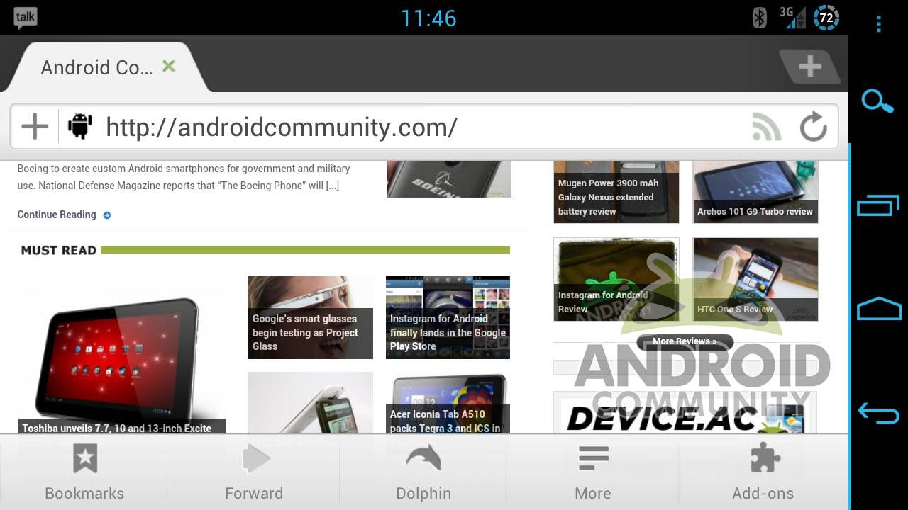
Even with a growing number of browser available on the Google Play Store, Dolphin Browser HD remains a favorite for power users, including those of us here at Android Community. The latest update adds a bevvy of new features, mostly surrounding Dolphin’s evolving user interface. The biggest change is a new menu bar that slims down the old double-row interface and hides a lot of the less immediate menu options behind more stylish icons, allowing users to keep an eye on more of the web window at once. You can download it for free in the Google Play Store.
Dolphin calls the the redesigned menu layout “spring cleaning”. The icons are reduced to the Bookmark bar shortcut, a combined forward/back button, a combined icon for both Gestures and the new voice search feature Dolphin Sonar, the “more” button that expands into the settings menu, and the right-hand menu bar. Refresh has been moved to the top bar and “Exit” is now hidden in the More button. The add-ons themselves get full titles instead of tiny icons, and there’s a new “go to top” button that appears automatically when scrolling up, which avoids backwards scrolling on long pages.
The gestures and Sonar interface get a facelift too, but that’s mostly cosmetic changes. What this update indicates is that Dolphin isn’t sitting on it’s heels – they’re in it for the long haul. A lot of these little changes bring about a minimal appearance and immediacy of function that I strive for when I customize desktop browser like Chrome and Firefox. The fact that the developers of Dolphin are adding them on their own tells me that this is my kind of browser. The “scroll to top” button alone is worth a try for any serious web user.


They have removed the refresh button from the menu, which means you have to
scroll to the top of the page before you can refresh it. This is a very bad move
as it means you can’t stay on the same part of a page and refresh
Yes, I agree. It puzzles me as to why Dolphin would elect to do this. It is now impossible to refresh a page without scrolling all the way back to the top of the webpage. Even with the new “jump to the top” pop-up button (which combined with the tabs showing up when you scroll up on a page is really annoying), this is much more of a hassle and slower to reload than the simple refresh button from the menu which used to exist in version 7. I also don’t understand the need to relocate the “Exit” command under the “more” menu. These are two of the most commonly used functions and Dolphin has made them both much harder to use. If the goal was to “clean up” the menu, then Dolphin could have removed the “bookmarks” and “add-ons” buttons in the menu bar or relocated those under the “more” button. The “bookmarks” and “add-ons” buttons that remain on the menu bar are superfluous anyway because both of these can be accessed by swiping sideways, which has always been a great and clever feature of Dolphin’s browser. If Dolphin is going to insist on forcing Sonar down its users throats at the expense of necessary, practical browser functions, then at least make the menus and settings customizable so users can remove the multiple redundant Sonar buttons that are used very infrequently. Dolphin HD has long been my favorite browser because of its practicality and functionality. If these types changes are signs of things to come, then I will have to start looking for a different browser to use.
I’m sorry to correct, but there is no combined back and forward button, only forward. And my device back button warns me that pushing it again will close browser, and it does. Removing an option to go back defeats the purpose of searching the web if you have to close browser and start search all over.