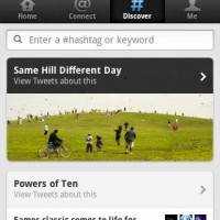
Facebook isn’t the only one in Android land getting a fancy new update. Twitter for Android just received its latest update today that matched it up with the recent changes to the web version. Some might not like the changes but I personally find it quite pleasing and easy to navigate. They’ve separated everything into four categories: Home, Connect, Discover, and Me.
As you’d expect home is your basic timeline as we all know and love full of 140 character comments of joy. Connect is quite neat and this provides on easy to access space for all your interaction from notifications, mentions, new followers, retweets, etc. all in one place. At first it seemed like too much going on in one tab for me but I quickly got the hang of the new design changes. Personally I’ll be sticking with Tweetdeck still — just saying.

Then we have keywords hashtags and trending topics all in the discover tab. Which makes complete sense for an area to discover new and exciting things. Make sure to search for #android and be sure to follow @androids for the latest news from Android Community. Obviously we shouldn’t really need to explain the “Me” tab much because that is pretty self explanatory otherwise you probably shouldn’t be using Twitter. Honestly I’m not sure if I like the new UI or not as the old was pretty good if you ask me. Either way the new experience should be easier, seamless, and much smoother so give it a try at the market link below.


