It’s not very often that Google updates the actual Play Store but when it does, expect major changes and new features. Last week, the tech giant started letting app developers add tags for better discovery. It was after we learned that it’s not suspending developers with old and unpublished apps. The past few weeks, Google has also been testing out a game subscription service and the Play Pass app. The company has been releasing several enhancements that we know will make the Play Store a better environment for everyone.
With more than two billion active users, the Google Play Store needs to be updated regularly. It is where the whole Android community come to check new apps, games, updates, and whatever digital content is needed. The latest visual refresh follows the update introduced back in June when Google rolled out an update with white background and accessible navigation.
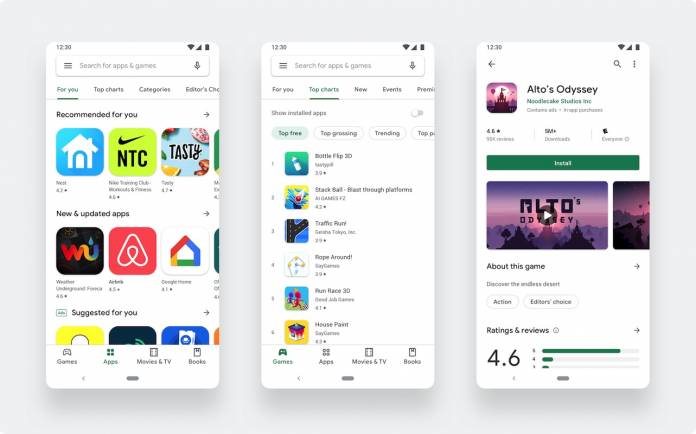
The latest change is a redesign of the Play Store. It’s a “complete visual redesign” so don’t be surprised if you see a new Google Play Store the next time you open the app. The updated app still follows the Material design language but is now cleaner. It looks and feels more premium as accessibility and app discovery have been improved for all kinds of mobile consumers.
The now kid-friendly Play Store also features a new navigation bar at the bottom for the mobile app version. The version for Chrome OS and tablets now features left navigation. Games and apps now have distinct destinations so they are more convenient to navigate. When you check a game or app, you will see a new listing page that offers richer information about the app. The call-to-action button is more obvious.
The Android devs have worked on a new icon system that stands out more. The shape is also more uniform now. For developers, check the store listing experiments page so you can test the best icon, video, descriptions, and images on Google Play. Feel free to add pre-registration or custom marketing messages to make your app stand out.


