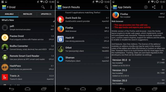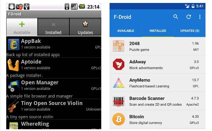
If you’re one of those “pure Android” fans that sought to go without Google and any of its services on your Android device, you might have come across F-Droid. It’s a free and open source Android app repository that you can use as an alternative to Google Play Store. And after six years of sporting pretty much the same look, F-Droid finally gets a user interface update.

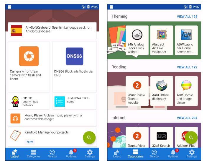
For years since its inception, F-Droid has sported a solitary look – the three tab layout. But in the upcoming update to version 0.103, get ready for a bump to the future… or present, as it were. The F-Droid team is updating the app repository’s UX for the better, and it will include some pretty major changes.

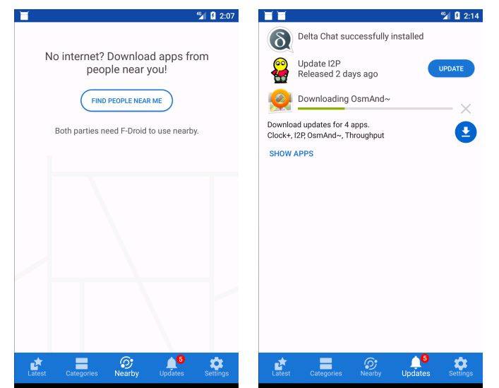
The update includes having screenshots and feature graphics for its app listings, much like the Play Store. It will also support bulk download and install, something pretty unique for F-Droid. The update also includes the ability to translate apps metadata, and it will have better notifications for downloads and pending updates.

If you’re an F-Droid user, this update will arrive like a breath of fresh air for your app repository that has retained a solitary look over the years. Some of you might even be surprised at how you have been able to hold on to that look for so long.
SOURCE: F-Droid


