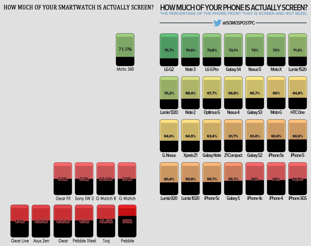
Bezels – hate them, but can’t do without them. Bezels do serve their purpose, but we want less and less of them and more screen, right? Now, with a nod to the original infographic for phones, this new one shows us which smartwatch gives you more screen usage for your money.
No prizes for guessing which comes first – it is Motorola’s Moto 360, which give us around 71.5% screen usage for its whole round-face aesthetic. The Moto 360 has been the runaway leader of the smartwatch market this early in the race, and it is because of that classic round design – and maybe the fact that Motorola opted to use more screen. In comparison, the LG G Watch R – a belated round-face design that tries to match with the Moto 360 – only uses over 51% of its round screen.

As with the phone infographic, the author says that the measurement starts from edge to edge and takes into consideration all of the things on the device’s face. The lowest percentage for a smartwatch’s screen usage belongs to the Pebble, with only 32% — which means that over 65% of the watch’s face is bezel. That’s just poor.
We dig that bezels are sometimes essential to the workings of our devices – although the Sharp Aquos Crystal phone begs to disagree – there’s just no excuse for them occupying more than half of our device’s front screens. You can maybe check out the phone infographic as well (linked above) to see how your devices stack up.
SOURCE: REDDIT


Revisit that whole sentence regarding the Pebble. The math is a little off, and no smartwatch is “all bevel”. Otherwise, a good story and all the more reason I am intrigued with the Moto 360.
Done. Thanks for the heads up.
32% screen + over 75% “all bezel” = one well written article
Updated now. Thanks for the catch.
i want 100%.. 😀