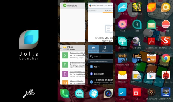
Jolla is indeed venturing into the Android world, one step at a time. After giving Nexus 4 and Nexus 5 users a chance to test Sailfish OS itself, the Finnish startup has started the closed alpha run for its Android homescreen replacement. But does Jolla Launcher have what it takes to stand out from the crowd? It’s a bit too early to say, but we take Jolla Launcher out for a spin to see its potential.
HUGE DISCLAIMER: Jolla Launcher for Android is currently in alpha. This means a very early stage in the development, at least for the Android version (the launcher on the Jolla phone itself is definitely stable). Although Jolla includes a list of known issues already, bugs, missing features, and slow performance is to be expected. So take this very early hands-on for what it is: a sneak preview.
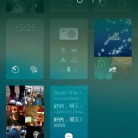
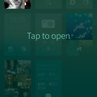
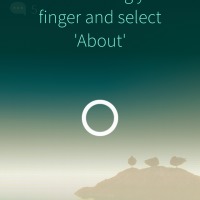
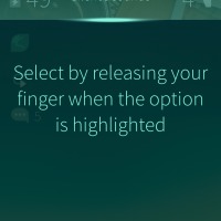
We had a brush with Jolla’s unique interface back when we took Sailfish OS for an unofficial spin on a Nokia N9. Naturally, the version that is slowly making its way to Android is quite different, and yet most of the basics are already there, at least as early as alpha. For those unfamiliar with it, there will be a tutorial, including exercises you must complete, to familiarize yourself with the launcher. Hopefully the final form will still included the tutorial stage, because you’ll definitely need it. Why? Because Jolla Launcher does introduce certain features that you’re unlikely to find in other Android launchers around, and they will definitely need getting used to.
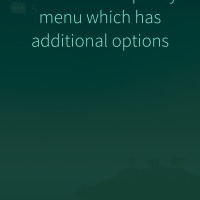
We’ve met the pulley menu gesture before. It basically lets you access menus with one hand by simply swiping down on the phone’s main view. This is admittedly a nice and somewhat addictive gesture, but unfortunately it can’t be applied on Android apps, as it is dependent on the underlying operating system. It is, however, present only for the launcher, especially in the lockscreen and when trying to close all running apps.
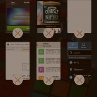
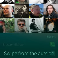
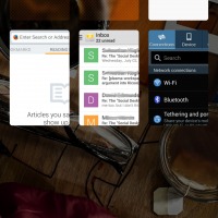
That last part is something that Jolla also does a bit differently. Sailfish takes its roots from a more regular kind of Linux, where running several apps is common and you most often than not have to close them yourselves. Jolla Launcher provides features for this kind of workflow, even on Android where multitasking isn’t as straightforward as that. Simply put, Jolla Launcher devotes a whole screen for showing currently running apps and previews of those apps (not yet working properly). Tapping and holding initiates a “close app” mode, putting close buttons on each of those windows. Alternatively, you can use the pulley menu to use the “Close all” action. Here’s where the Android integration gets messy. That running apps page doesn’t show recent apps, like what we might be used to on Android. When you close the app, it really disappears. If you want to see the list of recent apps, you’ll have to use your phone’s button for that (long press on the home button on the Galaxy Note 3). Another thing that Jolla Launcher does differently is letting you return to the homescreen by swiping from the left or right edge of device, from outside the screen. This can sometimes mess with the same gesture found in some apps.
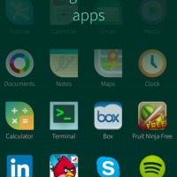
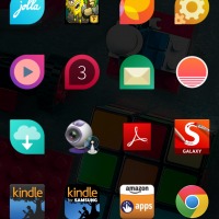
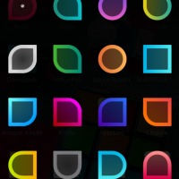
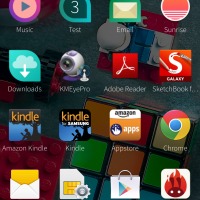
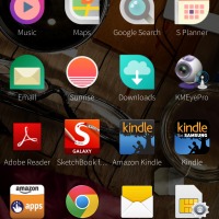
The app grid, which Jolla calls “Launcher”, is the messiest part at the moment. The apps are sorted alphabetically by default, but using their package names, not their display names, definitely a confusing situation. Luckily, you can rearrange them as you please. Tapping and holding on one icon enters a sort of edit mode (yes, it seems Jolla is fond of this modal system). From here on, you can rearrange them or even group them into folders. Now, Jolla does folders a bit differently. You can name them, yes, but you won’t see any preview of any of the icons in there. Instead, you will simply get a number of how many they are. You can choose a style for the teardrop icon though.
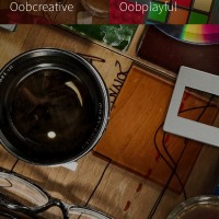
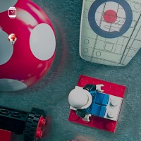
One thing that wasn’t available in the Sailfish OS port we tried before was Ambiance, available from a sideways swipe from the home or lock screen. This is basically Jolla’s theme engine. For now, there’s nothing special yet, as it only lets you change the wallpaper. You can’t actually choose your own wallpaper yet, but hopefully that will be coming in the future. Another thing that isn’t working yet, but is also a known issue, is the notifications. Jolla Launcher theoretically has its own way of viewing notifications, but at the moment they just don’t work and you’ll have to access them via the regular Android way. These leaves the notification icons on the lockscreen as simple decorations.
So is Jolla Launcher going to be the next big Android homescreen thing? Maybe not, even when it comes out in its completed form. The swipe-based interaction, especially the pulley menus, of the launcher is definitely a benefit to one-hand operation, even for something as large as the Galaxy Note 3. The Running Apps preview is also an interesting, though somewhat confusing, convention. But one feature that doesn’t seem to be even in the oven is sure to turn off a lot of users. Jolla Launcher doesn’t have space for widgets. It doesn’t even have space for “quick launch” icons except for the four at the bottom of the Running Apps screen. Now, those limitations might actually sound very familiar to users of that other mobile platform, but for most Android users, that might a deal breaker.
Still, the launcher is still in the alpha stage and Jolla isn’t mentioning any special plans for this Android port. For those who could get pass the lack of widgets, Jolla Launcher is a refreshingly new take on the Android launcher convention, and it is one that we will be keeping an eye on for a while.




as Thelma
explained I cannot believe that a stay at home mom can make $7420 in four weeks
on the internet . more info here Rex10.COM