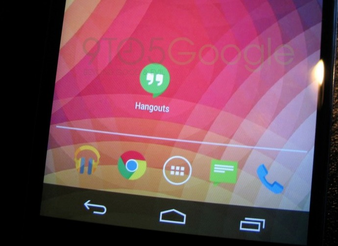
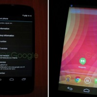
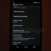
This fine Sunday afternoon a series of images have leaked which appear to reveal lots of changes in Android 4.4 KitKat. At this point KitKat has already been confirmed, so all we need now is to actually see it. Below is a few new photos that hit the web courtesy of 9to5Google reportedly showing the white notification bar colors, and a redesigned pile of Google applications.
We’ve reported a lot on the Nexus 5 and Android 4.4 KitKat since Google revealed them both last month, but nothing is official until Google announces it themselves. The images being provided certainly could be real, but at the same time there’s a few inconsistencies, to say the least.
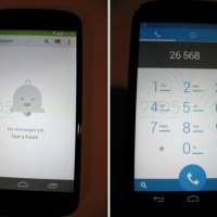
For one we see the white or grey color in the notification bar for clock, wifi, and battery, which we’ve seen before so that makes this feel legit. It’s the new redesigned messenger, phone dialer, and other changes that have our attention. One being how the notification bar color changes along with the app. Above you see the newly redesigned Messenger (with a new, flat logo) and the green extends into the notification bar. However, the dialer and its blue color blends in, and isn’t the same solid color. So while the changes seem legit, the inconsistent nature makes us question the leak.

It’s worth noting the new messenger looks a lot like Google+, right down to the new Mr. Jingles no new messages bell icon. And so far we have to admit some of these new changes sure look nice. We’re loving what we see, especially with the new phone app, as long as these are real of course.
The other leaked images shows the stock homescreen, wallpaper, and dock icons. It’s interesting to see a redesigned flat-looking messenger icon, yet the (also new) phone icon isn’t flat and has the usual appearance. Again, inconsistencies that make us question the images. Either way we’re excited about the leaks and expect more to come, and hopefully the rumored October 14th KitKat Nexus 5 reveal date ends up accurate.






Does Mr. Jingles move when you touch him?
That sounds wrong…
Looks Funny for Android 4.4
The phone app isn’t flat in that screenshot? Have another look.
Uuuuuuuugly. Hate flat look, much prefer 3d.
Look like cm rom …
is it me or is everyone going after the flat look? Microsoft pretty much started this metro UI trend yet people still bash them! Metro UI is much easier on system resources which is why all of their MS phones are so stable and require less power. IOS7 failed at that though making people dizzy and sick lol.