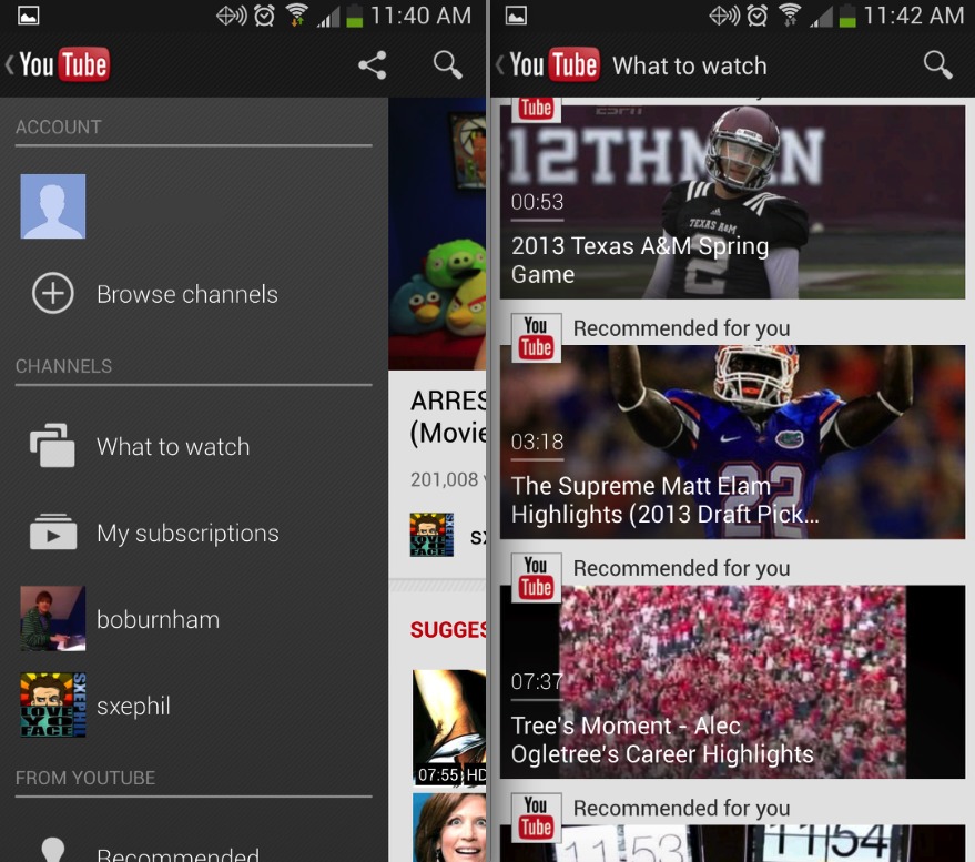
Google has been busy with updates as of late, and they’ve also been adding the popular slide-out navigation drawer to many of their popular apps. Gmail being the latest to receive this new navigation system, and today Google has improved the feature for YouTube, as well as a few other minor changes we’ll mention after the break.
For those wondering. Yes, YouTube already had the slide-out navigation bar before the update that arrived today. However, they did change a few things, the animation was tweaked, and the slide-out navigation panel is now available app wide. Before you could only access this from certain points in YouTube, now you can instantly side it out for quick access to channels, subscriptions, options and more.
They’ve removed the “app button” and now a simple swipe from the left edge or tap of the button on the top left will instantly open the slide-out menu. It’s a nice touch, but a small change. Those aside there really isn’t much new here, but here’s the full changelog from the Play Store.
* Open the guide from anywhere in the app for quick access to your subscriptions and feeds
* Video suggestion overlays during playback
* Bug fixes and stability improvements
Interestingly we also have “video suggestion overlays during playback” but we’ve yet to get any suggestions or overlay popups to appear while watching video. Have you seen this yet? Then of course we have the usual bug fixes and stability improvements. The comments on the Play Store are a mixed bag of happy and angry customers, so let us know how the update serves you in the comment section below. Get it, as always, for free from the link below.
SOURCE: Play Store


