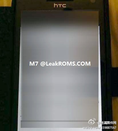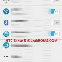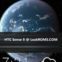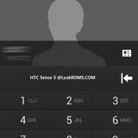
Now that all the CES news is starting to wind down we have some juicy pictures and details that were just revealed about HTC’s upcoming flagship Android smartphone. We’ve mentioned the HTC M7 before, but today we are getting what could be our first look at the handset along with leaked HTC Sense UI 5.0 screenshots. Check it out below.
While this is our first actual image of what could be the HTC M7, the photo surely doesn’t show us very much of the actual smartphone. From what we’re seeing HTC will be bringing their impressive polycarbonate design and new smartphone approach from Windows Phone 8 over to Android. I love the thought of it, just check out the HTC 8X Review from SlashGear for an idea of hardware. Below is also multiple HTC Sense UI 5.0 screenshots that have also leaked, but we have bad news.
The M7 is reportedly going to arrive with Android 4.1 or 4.2 Jelly Bean, and many sources claimed HTC would be going with on-screen navigation buttons and removing those pesky capacitive buttons of old. Sadly we’re still seeing that eye-sore better known as the legacy menu button in these screenshots. That means just like the HTC One series we’ll have 3 capacitive touch buttons, and a dedicated on-screen menu button when needed. Sadness.
From what we’re seeing the rumors suggesting a cleaner and leaner HTC Sense UI were accurate, but still looks just like Sense. We were hoping for a closer to stock Android look but that won’t be happening any time soon. Either way I’m more excited about this 4.7-inch 1080p quad-core smartphone after seeing a few screenshots. Hopefully images of the full smartphone leak soon — but expect it to look similar to HTC’s Windows Phone offerings.
[via HTCSource]


That is a really good looking UI! It looks like the product of good designers, and should look great on HTCs upcoming smartphones.
Sense 5: Still hate it. Hardware manufacturers: the most coding you should really be doing is to make some drivers. Let Google do the rest because YOU SUCK. Granted I haven’t used Sense 5.0 yet, but based on the screenshots here…candy-coated shit. It’s still shit.
This is completely fake why ?? @football the most tweeter on leaked UI and flagships said that the m7 would have buttons on screen so why do we see an menu bar under the keyboard ?? This must be a customized Rom on an one x because it doesn’t have a menu button on its hardware , even so , the lock screen didn’t convinced me the weather icons are bade and HTC from It’s first sense phone ha# a beautiful clock and weather widget so after updates it won’t bring a disgusting one please watch out!!
The new sense ui is going to be awesome its close enough to stock that the performance will be a lot better you can tell the dialer pad has tabs on top like nexus so contacts and dialer won’t take forever to respond anymore and pics from other sites show more its way better than anything I’ve seen. Imo