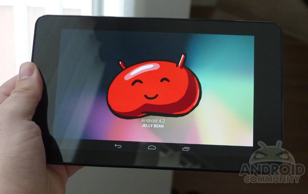
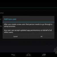
Now that Google‘s made Android 4.2 completely official, pushing the update out to the Nexus 7, Galaxy Nexus, as well as AOSP we figured a quick video was in order. Obviously you’ve seen plenty of Android 4.2 Jelly Bean from our LG Nexus 4 and 10 review, but today we’re taking a look at a few new features on the Nexus 7. Those being the brand new multiple user accounts, as well as lockscreen widgets to name a few.
With Android 4.2 Jelly Bean Google announced a lot of new features for such a minimal update. To learn everything about the update you’ll want to see our Android 4.2 what’s new post. The video below will give you a look at the lockscreen widgets, multiple user accounts (and mention a few issue) as well as the brand new clock app and more. We’ll be digging through all of this in detail soon, but enjoy the quick video below.
Obviously this was just released so we’ll be checking out more features as the week continues, but so far we’re loving what Google’s done here. Multi-user accounts are seamless and everything we expected so far — although we’ll need more time with it. Obviously each account has their own wallpaper, settings, notification sounds, apps, games and more, but we found the implementation a little odd. An app downloaded on two accounts will take double the space (which makes sense for game saves and such) yet updating on one account will update it across all device accounts that have the app. Being able to somehow manage this without wasting so much valuable space would be nice. For the full rundown enjoy the video below.
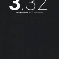
The lockscreen widgets are a bit goofy, but eventually will be an awesome feature set once developers start integrating their apps to support the service. You’re basically swiping between widgets like you do homescreens, and sort of makes things like a regular Gmail widget redundant if you’ve also got it on the lockscreen. Obviously not everyone will opt to use it on the lockscreen, so it still makes sense to have both. With phones we can instantly swipe to the side to open the camera, and I’m sure developers will be adding tons of options soon. This will soon be an awesome feature in Android 4.2 Jelly Bean as more deveopers get on board.
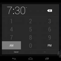
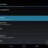
The new clock is quite unique. They’ve changed the design, UI elements, as well as made the first numbers always be bold. I’m not a fan, but slowly getting use to it. Aach different area of the new clock is slightly different, and certainly not uniform, but is a work in progress I suppose. I do like the new time input method for setting the clock and alarm however. Then we have gesture typing, which doesn’t need any introduction. This essentially wipes out 3rd party keyboards like Swype in favor of the stock experience from Google. The prediction is excellent and once you save words to your dictionary they work with ease in the prediction engine. The hovering preview of the word being gestured is a nice touch too.
Photo Sphere wasn’t quite feasible on the Nexus 7, which is an awesome new 360 panorama mode I’m sure you’ve seen plenty of, and Gmail has been slightly improved too with swipe to clear and pinch-to-zoom. While the update in numbers seems small, the improvements from Google are big. This is why we love Android! Stay tuned for more coming soon.


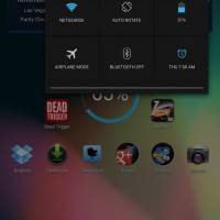
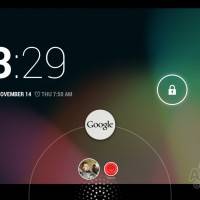


Haven’t tested multiuser yet, but the way they implemented lock screen widgets boggles my mind a bit. They will flash the left and right edges of your main lockscreen on _every_ wakeup to make sure you realize that “hey! you can swipe left and right here and add new widgets! did you know!?”. I find that quite annoying behavior even though the widgets are fine in principle.
Also, by default they provide no settings to make lockscreen widgets optional or to kind of “lock” a set of widgets in place so you won’t enter edit mode every time you touch one of them wrong or swipe to an as-of-yet empty lock screen.
As I said, the idea is nice but the implementation feels rather work-in-progress at this point.
Thank you for this comment, I feel the exact same way. There are just a few design aesthetics with 4.2 that need to be tweaked. It is just annoying to always see the highlighted box off to the left of the screen.
I sort of agree. It feels a little incomplete to be perfectly honest. Mixed feelings for sure.
I guess some of the other quirks are just something I need to get used to. For instance, Google Now having its own shortcut on the lockscreen (instead of being on the top of the unlock circle). Just seems like a weird design choice.
I also seem to have a tendency to bring down the Quick Settings bar instead of the Notification area 😛 Personally I think they could move the “activation” area over a bit more to the right edge of the device.
Haha….. Guess-ture. Too funny!!!
It’s laggy on the Nexus 7 . unless you were really looking for a feature skip this update. It also has small ugly cosmetic changes that I have no settings for. I wish I could roll it back.
I’ve added my son as a user on my 8gb nexus 7. Have to say that the tablet now seems way more sluggish than before, no wild increase in processes is in evidence due to his use either. Overall tablet use is simply slower. will have to compare with the wife’s single user tablet.
I’ve always been fascinated with the panoramic views. Is this out already, or does anyone know when this will be available?
Yes it is. Called Photo sphere
I looked forward to this feature till I discovered I can’t move a paid app to Another acct since I never use it. I refuse to pay twice.twice for any app.