Android 4.2 is coming, and coming soon. While we don’t know what to expect from Google and Android 4.2 or their upcoming LG Nexus 4, the details are slowly starting to leak through the cracks. What we have today is something that can’t fully be confirmed at this point, but it looks like Google will be introducing a dual or second notification pulldown bar for quick settings. Check out the video below.
The notification pulldown bar in Android has always been one of my favorite features. Showing users anything and everything in one neat and easy to access place is awesome. Google revamped this with Android 4.1 Jelly Bean and introduced expandable and collapsible notifications — which now gives us tons of additional details and the option to instantly react with notifications like never before.

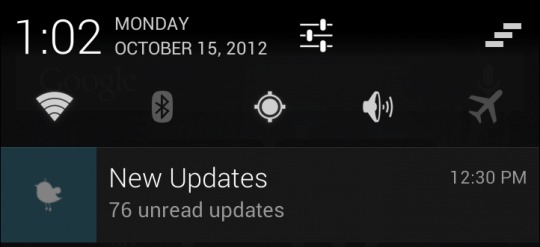
You’ve all seen those WiFi, Bluetooth, GPS, brightness, and more toggles that grace almost every custom and manufacturer build of Android right? If not see above. Well Google might have solved that problem. Check this out!
They are calling this “Quick Settings” which is a secondary notification pulldown bar that will provide us with quick settings for everything. The video above is reportedly the LG Nexus 4 running a newer build of Android 4.2 and the image provided above is actually from a system dumb. That is the actual image currently in the second pulldown bar, and soon it will be replaced with all those widget and settings toggles we love.
To access this, after you swipe down to reveal your notifications (which now show the clock and details again) a second swipe will reveal the new and improved Quick Settings — I love it. With Jelly Bean’s notifications getting bigger and expanding with details, we need all the space we can get. Why waste two lines up top with quick settings when a simple swipe can bring them up (or down) with ease? For now we just have a placeholder image but I can’t wait to see more about this — if indeed it is true and not just some fancy hack from developers. Stay tuned as we’re about to learn more and more from Android 4.2 coming soon.
[via Android Police]


I like the concept, and agree that the extra space in the main pulldown is needed for the expandable notifications, but why make the user pull down twice? Maybe split the shade…if you pull down on the left side you get the regular notifications (still full screen), and if you pull down on the right side of the shade you get the quick settings (also full screen). Just a thought.
That’s a terrible idea actually, what if you are using just one hand? “Sorry n00b onry switches or notifications for yuuu!”
Swiping is totally useless… The settings button is just there and lead to the settings screen with all the switches!
Google is capable to bring the most amazing innovation, but also strange things!
What are u talking about… quick toggles are so much easier and nicer..ive always wanted it stock but for now i have the paid version of MoreQuicklyPanel
Is It Coming With Sound Fix??? Efin Nexus Can’t Be Used As Sat nav Unless You Turn Engine Off… Ring Tone Volume Is Pathetic , Problem Admitted By Google But Treated As Medium….
http://code.google.com/p/android/issues/detail?id=35084#makechanges
Google isn’t gonna fix this..its a hardware issue..phone support denies a problem.email just says well pass it on..but phones out a year..I got it several months ago and very disappointed
Who’s going to create the first “YO DAWG, I heard you like Notification Bars….” meme?
That’s pretty cool, I’d really like to see this kind of double-swipe access to quick toggles and similar stuff. Considering how little time I spend trying out ROMs since I got my GNex, this would probably obviate one of the last reasons for me to go non-stock.
ANDROID is only competing with itself. No 1 , no OS is even near of Android
I just got 4.2 on gnex and don’t see any of this. The calendar icon on is different. Don’t see any second screen or quick swipe at all. Calendar days have pinch to zoom..don’t know if that’s diff. No gmail changes yet either
I’m pretty sure you have 4.1.2 not 4.2