


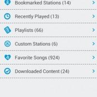
The Slacker Radio has recently been updated and while we are fans of the new look and new design, we will offer the warning up front — if you are really loving your currently installed version of the app, you may want to hold off on this update. While the core features of the app seem to have remained the same, the look and feel has been given a complete overhaul. You can get a look at that in the image below, even the app icon has undergone a dramatic change.
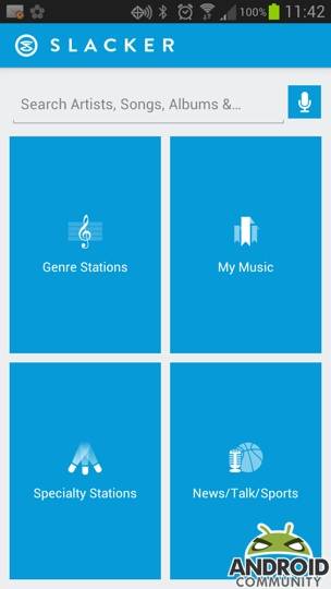
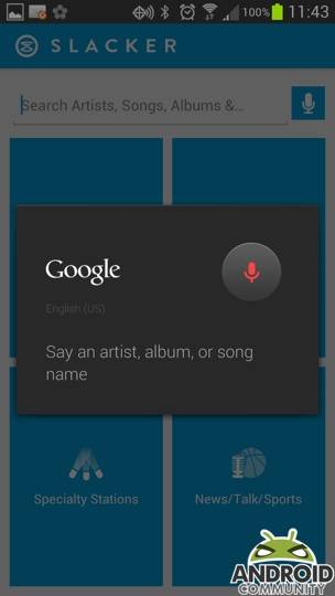
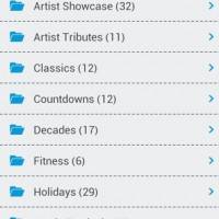
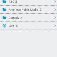
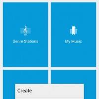
As you see, the new Slacker Radio icon is orange, however once opened, the change jumps out. The app opens to what you see below — aside from the blue, things are simple and easy to navigate. You can start by searching (using text or voice), or by clicking one of the four options. These options include Genre Stations, My Music, Specialty Stations and News/Talk/Sports and should all sound familiar for current Slacker users.
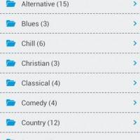
The key here, they are all seemingly easier to navigate to with this update. Once inside any of those sections you will still have your familiar categories and aside from the different colors, things will seem pretty familiar. The main change in design seems to come in with that first launch screen. Otherwise, looking at the Google Play Store listing for the Slacker app and things remain somewhat of a mystery as to where this is going.
The ‘what’s new’ section simply notes that “this is the initial release of the new, redesigned Slacker Radio v4.0.” Simple and to the point, but we do wonder where things will go from here. All said and done, as things stand, we have to say that Slacker appears to have done something really nice with the app. Though, it was a bit shocking on that first launch. In addition to the Android app, the Slacker Radio website has also been updated.
[via Google Play Store]


Resigned? Or redesigned
Don’t forget about the redesigned widget as well. You might want to add a screenshot of that too
Screenshot of the new widget.