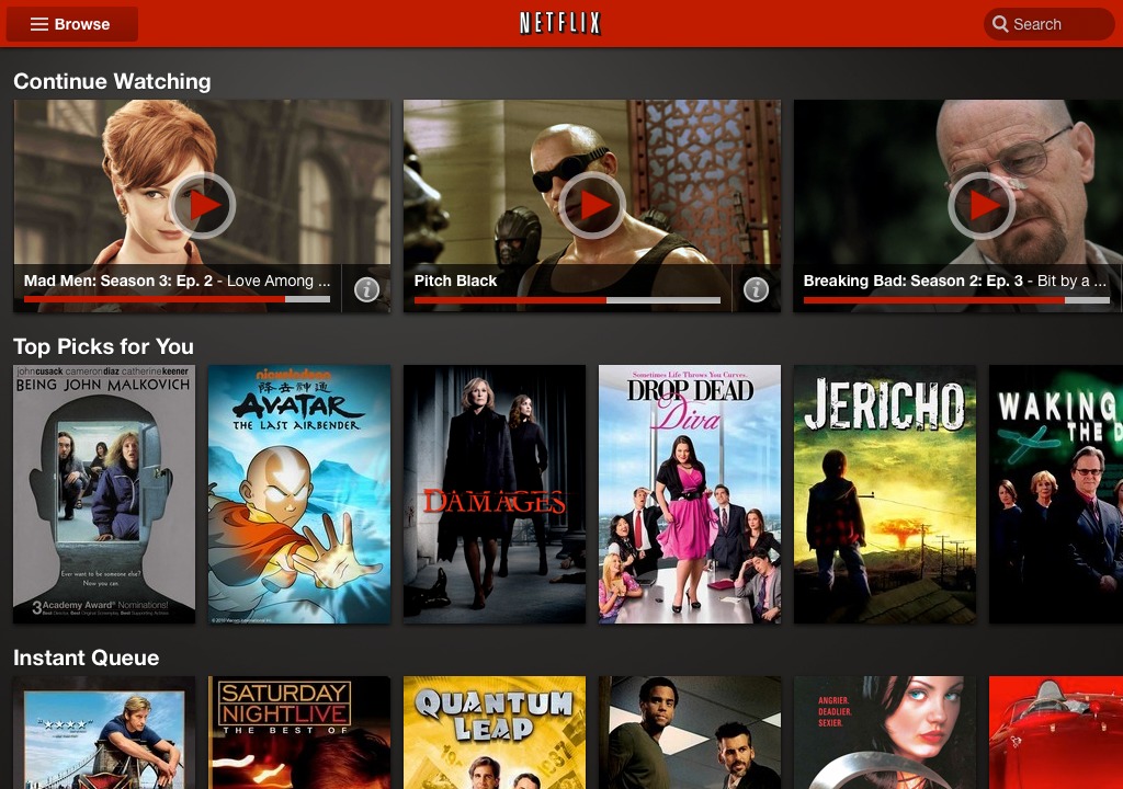
Netflix customers using an Android tablet got a surprise late last night, when a new version of the Android app sporting a completely revamped UI showed up in the Market. The new user interface appears to be contingent upon screen resolution, not operating system, so those of you rocking a Froyo or Gingerbread tablet can get in on the action as well. In a few days the new UI will be showing up on the Nook Tablet and Kindle Fire.
The layout mimics the one seen on the web version of Netflix, which has graced desktop browsers for the last few months. The sliding, scrolling list of panels allows users to swipe left or right to see more movies or TV shows, an innovation that Netflix says gets twice as many titles on-screen as before. Previously tablet users, no matter what their operating system, used the same list-based interface as everyone else, filling up relatively large screens with lots of wasted white space.
The fact that the interface works on older versions of Android is particularly exciting – CyanogenMod users on their hacked Nook Colors or HP TouchPads will surely appreciate it. As the Fire and Nook Tablet gain popularity this holiday season, expect to see more and more apps take this backwards-compatible approach to take advantage of these reader/tablets older versions of Android. The updated version is available in the Android Market right now.


On my Samsung Galaxy 10.1, when the new Netflix is opened and I go to “select season”, the application quits and go back to the home screen.
Mine is doing the exact same thing on mt galaxy tab 10.1…i called netflix and they said there was nothing wrong and it was a problem with my tab…prety releved its not just me!