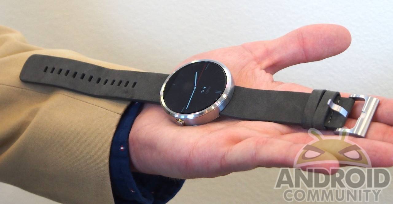
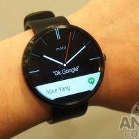
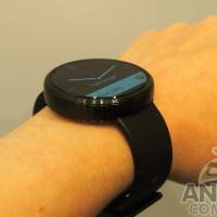
Bad puns aside, Motorola‘s Moto 360 is definitely going to be the most eye-catching piece of Android Wear to hit the market. But is the Moto 360 more than just a pretty (watch) face? We take a brief hands-on tour to find out, and we were left pleasantly surprised and wanting for more.
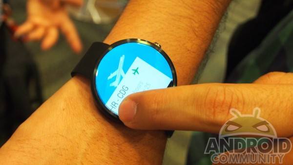
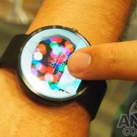
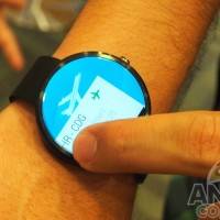
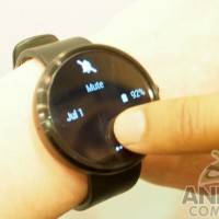
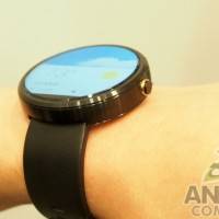
According to LG, the rectangular surface of its G Watch has more room for pixels. Moto G, apparently, has a different goal when it decided to use a round shape, aside from looking very classy. It turns out that the circular shape gives more space for the finger to swipe with. That said, not all of the screen is occupied by the display, with a very small patch at the bottom cutting off the circle to house the display components. Swiping is, of course, the main interaction mode of this smartwatch, aside from Google Now voice commands. Swiping down from the very top reveals the counterpart of a notification panel that shows battery percentage as well as controls to mute the device, which apparently also disables Google’s speech recognition.
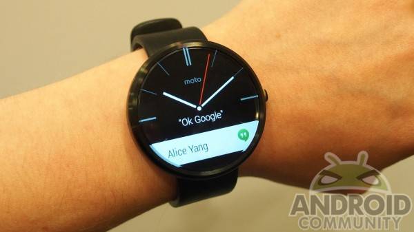
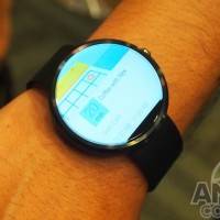
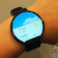
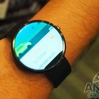
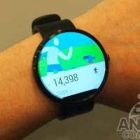
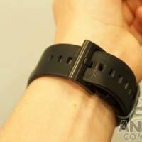
One of the earliest criticisms about the Moto 360 from the very first time it was seen on an actual wrist was that it looked quite big. Motorola, however, insists that it has followed the standard measurements for circular watch faces. The straps are also standardized and is said to be replaceable with normal standard-sized straps. But even if you don’t buy into that size defense, the Moto 360 turned out to be very, very light. It was almost as if we were handling a dummy unit instead of a truly functional Android Wear smartwatch. The face itself is rather nondescript and would blend well with other regular watches. Even the lone hardware button, which is used to return to the “home” screen, is shaped to look like a regular watch winder.
This brief brush with the Moto 360 definitely left us impressed and excited to see more. Unfortunately, unlike the other two smartwatches at Google I/O today, Motorola is keeping things under tight wraps. It won’t even turn over the device to reveal the backside, presumably to hide some details about its wireless charging, which has already been leaked anyway. The manufacturer isn’t also giving any details about specs and availability. But if the final product is anything like what we’ve seen and touched here, it is one that might be worth waiting for before you make a purchase decision. And there is definitely time to decide, as the Moto 360 won’t be available until sometime later this summer.







That is a thing of beauty
Of all the new Android Wear watches being showed off, I give this one my undivided attention. Hope they get it right.
This will carry a nice price premium espically with the wireless charging. I’m going to say this will have an 100$ premium if not more with the silver version with the metal band over the Sammy and LG
299$ plus (conservative estimated) for a smart watch? Nope that’s my galaxy note 4 money…
How does it perform under the sun? We’ll we be able to see anything or will it work like phones that you always have a hard time to use outside.