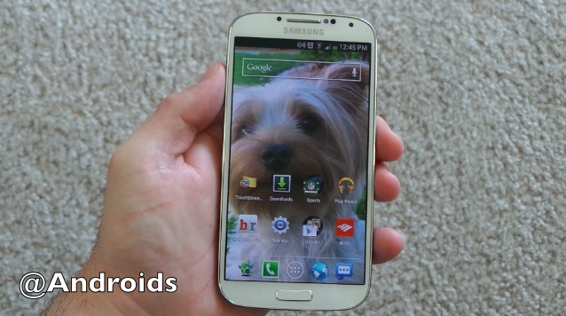
During the Apple keynote yesterday we saw a lot of interesting and exciting new things with iOS 7, many of which have been available on Android for some time, but we won’t get into that now. The most impressive new feature and UI aspect (for me) was this “liveliness” 3D wallpaper doing the parallax effect. Showing the background image move as you tilt the device. Thanks to an eagle-eyed reader we’ve learned this is nothing new for Android. Check out our hands-on below of what surely is my favorite new app.
This neat and snazzy little feature is called the parallax effect, and I didn’t even know we could enjoy such awesomeness on our Android smartphones and tablets. When you move the phone the background image appears as if it’s in 3D and will pan and tilt to your motion. Using the gyroscope in the smartphone, the feature is visually impressive to say the least.
It’s certainly neat, and something I was in awe of when Apple showed it off on screen. I instantly wanted it, and sure enough I now have it, well before any users are enjoying iOS 7. Thankfully here in the Android world we’ve had live wallpapers for a long, long time, and this feature isn’t anything new. After a reader tipped us off about an app called 3D Image Live Wallpaper. Check it out in action below.
The video is pretty self explanatory and will give you a good idea of what we’re working with here. The app basically makes your wallpaper feel like an immersive and lively 3D image. I’m a huge fan and wish I’d heard about this sooner. The app has been available since November of 2012, and we’ve found a few more while digging through the Play Store.
3D Image Live Wallpaper is available now at the link below for about $1.60 and will let you use multiple Android 4.2 images (that come with the app) or you can select any custom image of your choosing. This gives us that neat effect we saw from Apple and iOS yesterday, only you can have it right now.
Ahh. I love technology! Give it a try today and let us know what you think. Don’t forget to head into settings and increase all the effects for some real fun.
SOURCE: Play Store


Oh oh…here comes Apple with the lawsuit….(although it was in the Play Store since November)
No kidding! These days I’m afraid to wipe my ass as Apple has likely invented the toilet paper I use too.
no, but they have the wiping moves patented!
I’ve been using this app forever.
Some images that I found to be cool…
A picture of a campfire or a picture of a starfield/nebula/space
Yes. Campfire is awesome.
Does Google have the patients to sue Apple? And I think that 3D wallpaper has been on cydia for years.
Actually, this was a Jailbreak tweak some dev made for iOS back in early 2012
Control centre also seems to be inspired from cydia repo’s.
also apple hired the guy who invented the iphone control center (on cydia repos)
also, looks like apple was “beta testing” this in the audio controls in ios6 — more info here: http://www.idownloadblog.com/2012/06/12/music-volume-knob-detail/
It’s kind of sad, though, that so many poeple find this gimmick to be the most exciting part of the OS update. Beside the fact that this kind of stuff has been around for a long time on other platforms, Apple has a lot to catch up on in terms of actual functionality, so this really shouldn’t be the most exciting advancement of the iPhone.
I use this: https://play.google.com/store/apps/details?id=at.robbert.deepand
Available since 1½ years in Google Play…
I have been using the live wallpaper feature in Photaf Panorama Pro for a couple of years. This isn’t new or impressive, but I’m sure Apple will pretend it is.
It didn’t work for me immediately (because it wouldn’t size my pictures correctly when I used a custom image) but eventually I got it to work, and it’s a pretty neat effect. Not sure what it does to battery life yet, though.
Not working on Note 2
So when Apple added parallax, they added it deeply into their developer APIs making it easy for developers to add for their own apps and making it standard across the platform with in the built in apps.
They then demo this feature in one instance… the desktop/wall paper area. But it represent a fundamental UI commitment and developers are asked to follow suite.
Am I the only one that thinks pointing out an existing Android app will add parallax to the wallpaper is NOT the same thing?
If it was just about the wall paper that would be one thing, but this will be a consistent UI element to most iOS apps going forward. So a trick to add it to wallpapers is really not comparable.
Unless you point is you can make your Android phone sort of look like iOS.
You are exactly right. The problem is that people’s mentality tends to judge from one little point and assume he knows everything from that. For a very obvious reason, Apple will not introduce this as the most advanced feature if it’s just for a live wallpaper. Parallax effect is the whole platform. That’s why they use thin line, thin font, and that’s why they design the icon looks flat and bright. Because only with those elements, the parallax effect for every elements (icons, texts, backgrounds, etc) will only work. Also, the only way Android or other platform try to mimic this, is to change their whole coding from drawing board and requires pretty high end hardware not to mention true retina (not the pentile screen ala Samsung phone) screen to display the finest details and lines.
How did you set it up , can you tell us the setting please.