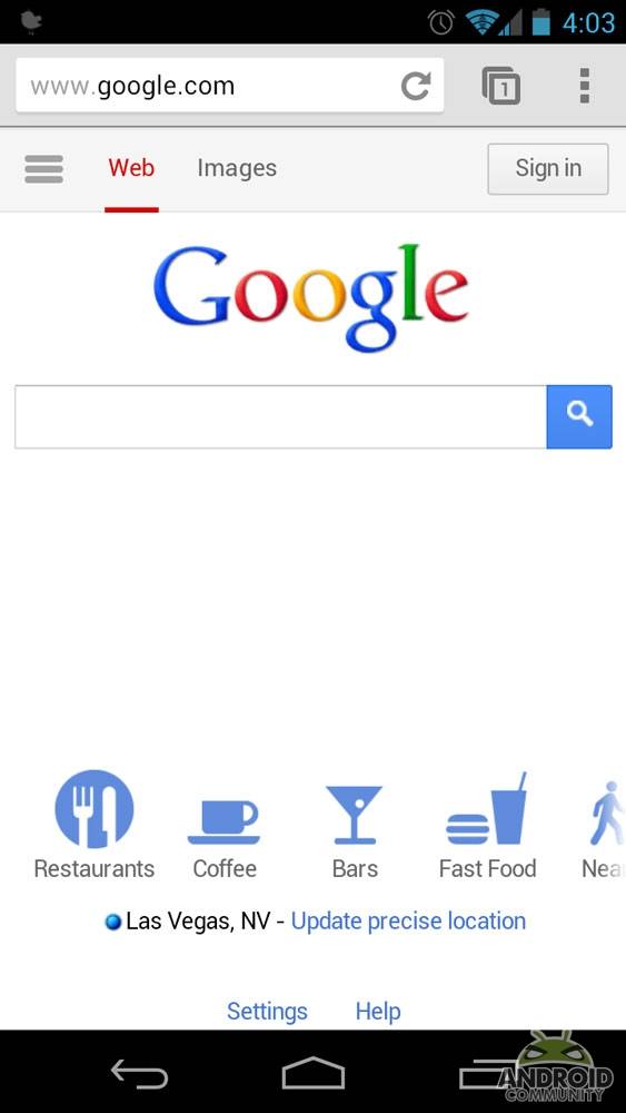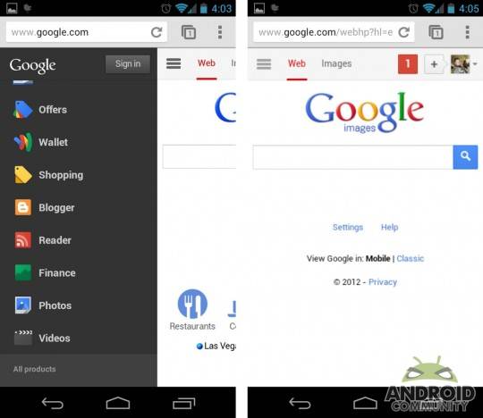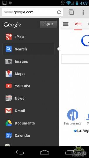
That awesome black menu bar that Google users have enjoyed when using the search engine via their computer browser? It’s just been ported to the mobile version of Google’s homepage, as you can see in the screenshots below. The various links nestled in the normal Google homepage are available in a hidden menu on the left side of the screen called the “Options” tab.
To see a menu with links to the most commonly used Google services (visible in the screenshot below), tap the “Options” tab. If the service you want isn’t listed on the left-side menu, you can find it by selecting “All Products” located on the bottom of the menu. Tapping the Options tab again closes the menu.
The next tab in the series is the Search tab, which is the default tab that will be opened when you use Google via your mobile. The third and last tab is the image search tab, and it functions the same as the Options tab. Tap the Image tab to open Google Image search, then tap it again to close it.
For those with a Google+ account, your G+ profile picture will appear to the right of the Image Search tab. If you’re not logged into your Google+ account, you’ll see a sign in button instead. New Google+ notifications will be listed over the picture, and, obviously, tapping them will pull up your account. The new homepage seems to show up on all mobile devices, not just mobiles running Android. We’ve found, however, that while Chrome shows the new homepage, the standard WebKit browser currently doesn’t.
[via The Android Soul]


I HATE THIS! Plus, “android community” nice mobile website! Not
Earlier I use to get…this way of homepage …but now…I am getting the old one how can I again switch to that old design