If you compare your YouTube app with that of your friend, chances are you might not be seeing the same thing or at least you’ll see something slightly different. That’s because they have been experimenting a lot with various elements within the app and testing them out on random, various users. Two things that users have noticed that are different from the previous, official version are the new icon for the floating action button and a new look for the uploading content page.
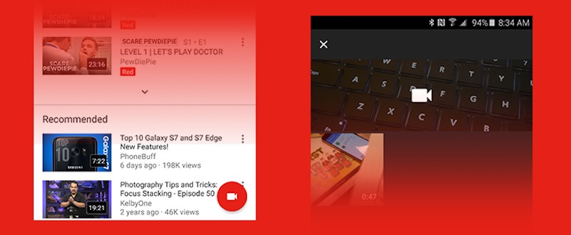
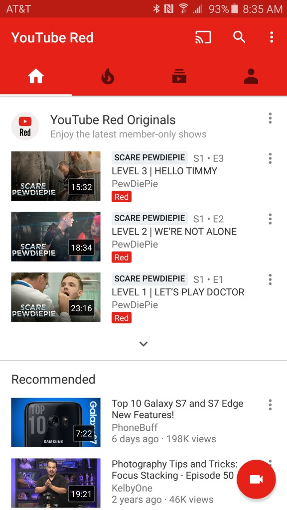
The FAB (floating action button) for some users is still the old arrow pointing upwards. But YouTube has changed it for some, replacing the old one with the camcorder icon. Now there is no change at all to its functionality. Both icons will still lead you to a page where you can upload videos onto your YouTube channel.

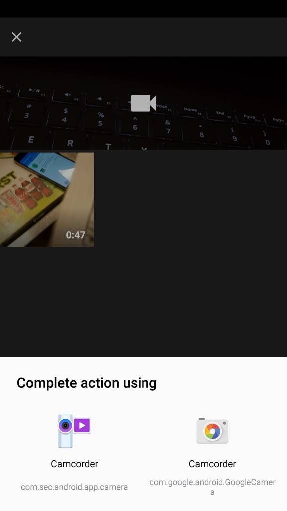
The new upload screen might also look much different for some users. The original screen has a white background with a list of videos that are found on the device. The new UI that is being tested out to some users still has the grid of videos, but now with a gray background and a live view from the camera. It might lead you to believe that you can now record videos from the YouTube app itself, but alas, it is just a shortcut to your default video app.

There is no way to force the new interface onto your app as YouTube is still randomly experimenting who receives it and who doesn’t. So just patiently wait for it to come to you, even though the changes really don’t bring anything significant to your YouTube experience.
VIA: Android Police


