Google is doing some improvements to the YouTube app. The tech giant is always working on to enhance the watching experience on the video sharing app as it is one of its biggest brands today. The YouTube Android app is getting a better look with the latest update, hoping to bring a more convenient navigation and more consistent layout within the app and across mobile.
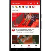
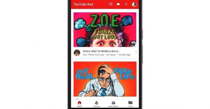
The YouTube team has been hearing suggestions and feedback from the people. They listened and so they are incorporating some of them. With the update, the app now shows Navigation tabs with clear labels. Meanwhile, the tabs have been moved to the bottom so they are easier to reach with the thumb. You can also see them on all pages now except on the Watch page.
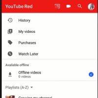
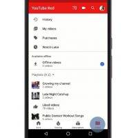
YouTube has separated the Library and Account. You will find your watch history, video uploads, and playlist in the Library section. You can view Account and Settings from your profile icon which is found in the upper-right portion of the screen.
YouTube devs also made it possible for you to pick up where you left off on the app and on each tap so you don’t have to scroll up or down again. It will remember where you last went or scrolled.
On the Home screen, you will see the recent uploads from the channels you subscribe to. Recommended videos will also be shown. To know the trending videos, click on the Trending tab. List of the channels is listed on the top.
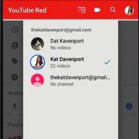
You can cast videos, search, or upload a video with the options you see up top on the YouTube app for Android. Choose the channel icon if you want to switch accounts, manage notifications, or access your channel.
SOURCE: YouTube Help Forum


