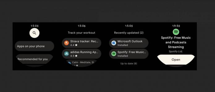
At the Google I/O 2021 conference earlier this year, we learned we will be getting a new Wear OS 3.0 UI. What that will look like was shown off in an emulator preview which you can see at the Android Studio Beta emulator. The update is expected to roll out later this year but it seems like we’re getting a fresh UI of the on-wearable Wear OS Google Play Store which matches what we see in the Wear OS 3.0 emulator.
9 to 5 Google shares some of the details seen in the redesigned UI for the Wear OS Play Store. Each item in a list is now placed inside a pill-shaped card which makes it easier to see and read them as the card has a light gray color scheme. Previously everything was in a pure black background and so it was sometimes hard to read items especially on a small screen like a smartwatch. The pill-shaped card starts on the main homescreen.
Meanwhile, the search button is placed in a white circle which again makes it more readable than when it was on a green circle. After the homescreen, the apps are listed on the left together with the respective icon. The name of the app is then followed by the star rating located underneath. Finally, this card-based motif is also see in the My Apps updates page. The “open” button is also pill-shaped and occupies the entire width of the display.
Placing the items on a card actually makes things look less cramped on your smartwatch screen. The slight color added instead of the white text on black background is a big help to make the items ore readable. These seem to be small changes but are actually pretty important towards improving the user interface of the Play Store on your wearable. You can always install stuff from your connected phone of course, but for times when you need the smaller screen, at least you know the UI is better.
The update doesn’t seem to be widely available yet although some users have reportedly received it. There’s also no confirmation when the new Wear OS 3.0 update will start rolling out to Wear OS smartwatches.


