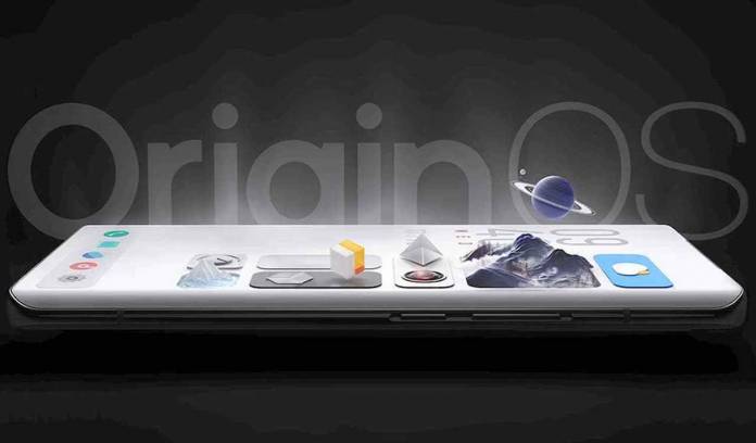
OEMs have long managed to come up with their own versions of Android. Mainly, new skins or UI are introduced to make the MOBILE platform look more different or customized than regular Android. The likes of OPPO and Xiaomi have shown clearer versions for experience and better look than the near-stock design. Vivo is joining the fun by announcing the OriginOS. A closer look at the new platform design will have you thinking it is a totally different mobile OS.
Vivo has called this OriginOS. Some may not admit it but it reminds you a bit of the iOS by Apple. It may also look close to the Fluid Design aesthetic of Microsoft.
The rounded corners on the boxes are a giveaway—looking like iOS. The home screen looks the usual with a grid-based design (Huarong Grid). The widgets, called “atomic notifications”, can be easily and neatly placed there.
OriginOS is still based on Android. It can do a lot of things iOS cannot like the dynamic home screen. The latter can change the colors or wallpapers depending on the weather or other real-world conditions wit the Sky Windows/Time Windows feature .
Vivo proudly announced this new operating system yesterday at a press conference. It’s very much different from Funtouch OS when it comes to interaction and UI. The team has worked on the Weather app, Navigation gestures, and Supercards/behavior icons and made special changes.
OriginOS also brings a new memory fusion system that will take advantage of the device’s onboard storage (Multi-Turbo 5.0). There is no mention what smartphone will run on OriginOS first. We just know Vivo phone users can switch from Funtouch OS to OriginOS.


