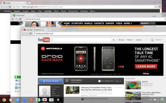
Let’s step back from Android for a moment and take a look at Google’s other OS. With no major updates since the Chromebooks launched last year, Chrome OS (the x86 self-contained Linux OS based on the desktop Chrome browser) is looking like the red-headed stepchild of the Google family. But it’s finally getting some long-overdue love with the unveiling of a new “Aura” window manager and user interface. Those of you who use a certain Redmond product may notice a few… fleeting similarities.
Yup, the newly updated Chrome OS bears a striking resemblance to Windows 7, with independent browser windows, and shortcuts and settings controls in a taskbar shelf. Previously Chrome OS was more or less a single Chrome window that handled everything – you could have as many tabs and extensions as you liked, but they were always limited to the primary Chrome frame. The updated Chrome OS still does everything in the browser (all the shortcuts are basically fancy links, or as Chrome calls them, “web apps”) but now you can manage multiple windows and switch between them with the shelf.
Conceptually, this is something of a step backwards for Chrome OS. The original project was supposed to focus on simplicity – offer a browser and nothing more, with all the tools users were used to residing in the cloud (and hopefully on Google services). And for regular Chrome users, it did work pretty well: log in to Google and all your extensions and bookmarks are right there in front of you. No files, no settings, no windows. Just the web.
The problem came when non-technical people tried to use Chrome OS, often on something that looked indistinguishable from a “normal” laptop. Instead of the familiar (if aesthetically displeasing) setup of a wallpapered desktop and some kind of control bar, it was browser through and through. Simplifying the web experience may have actually alienated the very users Google was trying to woo, who don’t handle change well no matter what the benefits. The more technically complicated UI in the updated Chrome OS is, in a roundabout but very real way, more friendly than a basic web interface.
In addition to the overhauled UI, the latest version of Chrome includes multi-monitor support and better handling of compressed files. You can download the latest Chromium build to compile the OS yourself – it should roll out to the various Chromebook models in the next few weeks.
[via TechCrunch]


