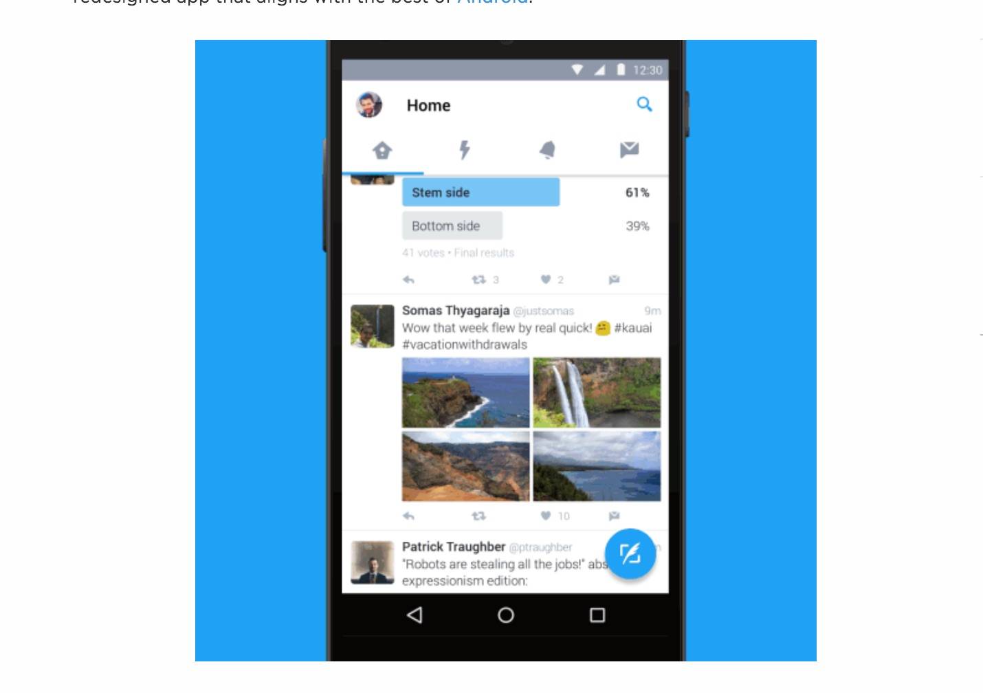
Even though you probably use the Twitter app a lot, you know that their official Android app needs to improve a lot. Either you make do with what you have now, or you use one of those third-party apps that have much better functionalities than the official one. But the latest update, or more like refresh, brings a much improved user interface and a better way of navigating throughout the app, which might make you want to go back to using it.
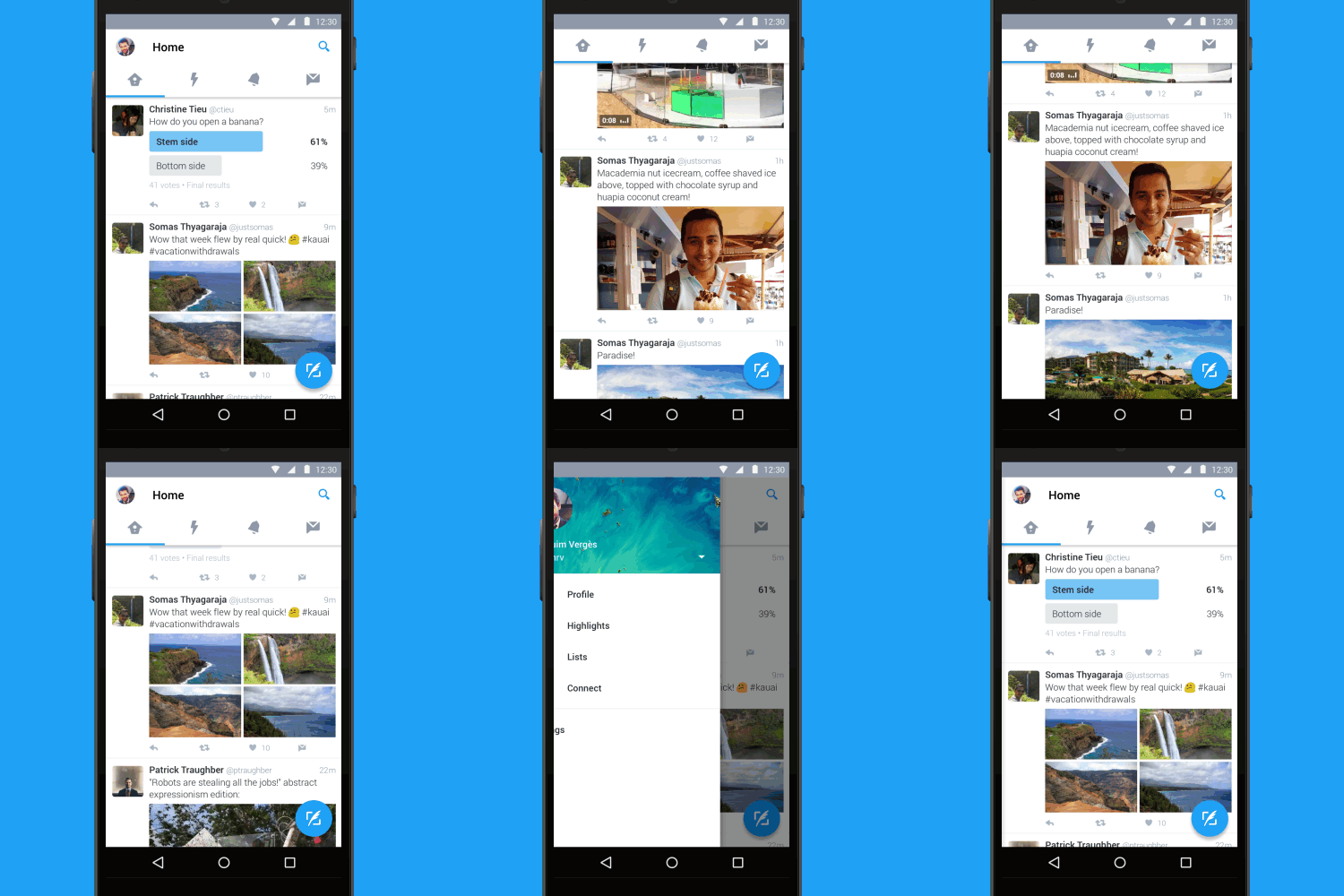
For one thing, it’s now easier to navigate through your timeline, moments, notifications, and direct messages. The buttons are much bigger, and more importantly, you can swipe left or right to switch between these feeds. Since we now live in a swipe left or right world (thanks a lot Snapchat), having this on your Twitter app is really much more convenient.
The other sections that were previously seen on the “…” menu, which didn’t really look that great, can now be found through a slide out pane on the side of the screen. This includes profile, highlights, your lists, and connect (to find new people to follow). And since this update has made the app even more Material Design-y, then it’s only natural that you now get the Floating Action Button (FAB) so you can start writing your tweet easily.
The update has already started rolling out globally today, but it might not reach all territories at the same time. So just check your Twitter app’s Google Play page to see if it has reached you already.

SOURCE: Twitter


