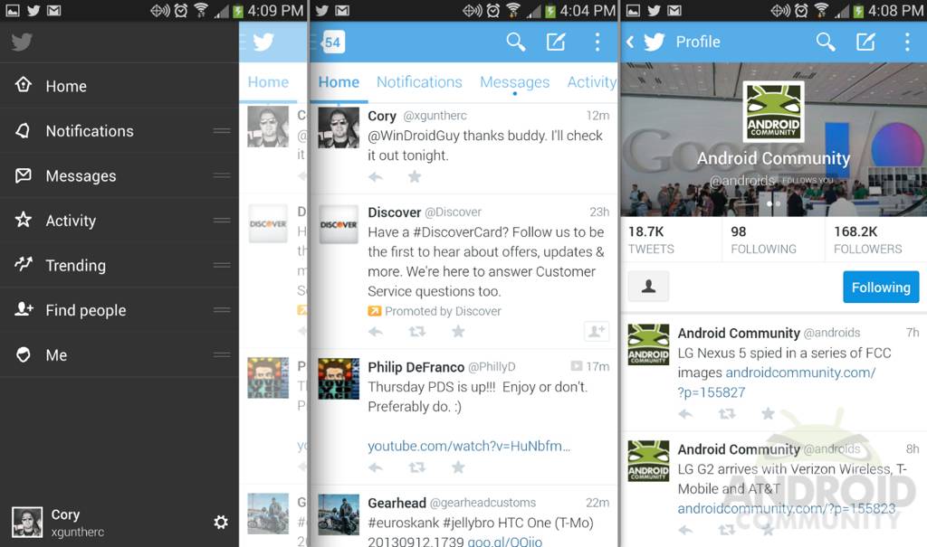
Just two weeks after announcing a new beta tester program for Android users, Twitter has just pushed out a massive update to their app. It’s a completely revamped version 5.0 beta, and so far we’re big fans. The entire interface is new with Android-style tabs, slide-out navigation, and a decent action bar to name a few.
If you signed up for the confusing Twitter beta on Google Groups, you’ll want to run to the Play Store and get the latest Twitter version 5.0 right this minute. With in-line photos and more, Twitter is finally starting to come around. If they aren’t going to let developers make great apps for the millions, they’d better at least give us more options for their excuse for an Android app, and now they’re starting to do just that.
The hamburger menu buttons and slide-out navigation bar we’ve seen in YouTube, Google+, Facebook and more has been added, but for the most part it’s redundant here on Twitter. We’ll take it though. It even uses a blurred out version of your own Twitter page background, which is a nice touch. So far we like it, but the sliding can get laggy at times.

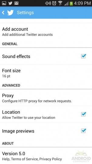
Then as you can see from our images we have in-line image previews, something many third party apps have been offering and is a must for most die-hard Twitter users. So that’s a huge plus. You can disable them too, if you’d like. Surprisingly we have in-line photos and a nice viewer, but still no built-in browser, which seems odd. These few things aside the brand new style on Twitter is rather nice, and it feels nearly ready for a broad release.
Hopefully after this beta test today the official Twitter app for the millions of Android users gets rolled out. Otherwise, grab it from the folks at AndroidPolice if you’re too impatient to wait. I’ll stick to Robird. Don’t forget to follow us at @Androids.
VIA: Play Store


Still no PUSH?!