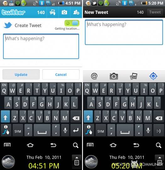
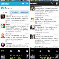
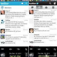
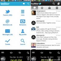
Twitter has released their second big official app version in 2.0 for Android, and it looks fabulous. The first major change you’ll notice is the reduction of elements, the app opening up directly to your friends stream rather than bringing you to a page of options (that used to contain tweets, lists, mentions, retweets, messages, my profile, trends, and search.) Each of the items that used to be contained on the initial opening screen are still available, but have essentially been pushed up to the top of the screen where they should have been in the first place to make room for the lists of tweets and such they’re in place to display. NOTE several of the images in this post contain two screens – the left is the version of Twitter right before this update, the right is the current version 2.0.
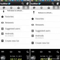
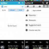
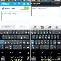
One of the other notable changes is the move away from BRIGHT BLUE to black. You’ll still see the blue accent in the twitter bird in the upper left of the screen, but it’s no longer so overbearing. Next to the logo along the topmost bar you’ll see the magnifying glass (for search) and the pencil and paper (for writing a new tweet.) The second bar of buttons contains a speech bubble (containing your main friend’s tweet stream,) @ symbol (containing all of the instances where someone has mentioned your twitter name,) letter with down arrow (your private messages,) and a list icon (which contains several more options that aren’t used as often.) This final list icon contains the following: Favorites, Retweets, Suggested Users, and Create New List. There’s also a “Tap to Refresh” which transforms into “Pull down to refresh”* when you’ve added any items to this list area.

This list area is where you’ll be able to view any of the Twitter users lists you’ve created as well as being a simple list creation panel for your future list making. This area (amongst several others) makes the process of using Twitter so enjoyable that you’ll never want to return to the desktop portal to the system.
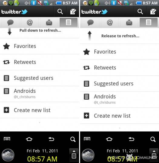
*”Pull down to refresh” is probably the greatest addition Twitter has made to this version of the app. All you’ve got to do to see all the newest tweets that’ve happened since you first opened your list is to tug down on the list and let go. Poof! New tweets. This is fabulous because if you were to leave the tweets streaming, not only would your data usage potentially go through the roof from constant checking, you’d never be able to read a tweet because the whole list would be constantly moving. This pull down feature appears in several places in the new app.
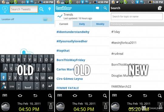
Trending topics have disappeared! Or so it would seem. In fact they’ve just been knocked down a few pegs (do to non-use I would assume) to the search area. Since the search panel only requires a single line up near the top, it makes perfect sense to fill the rest of the screen with up to date trending topics. Well placed.
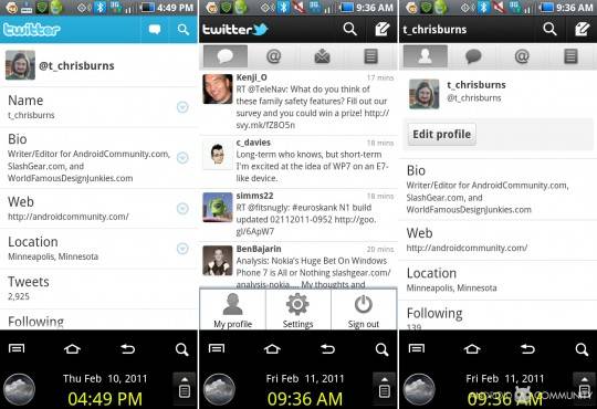
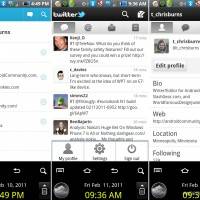
Another well placed button is “My Profile.” Since this page is probably accessed once a month by people who wish to update their information, the button for My Profile has been relocated to the menu accessed on the main screen with your physical Android menu button. My Profile ends up looking essentially the same as the old version, with a gigantic EDIT button being a welcome change.
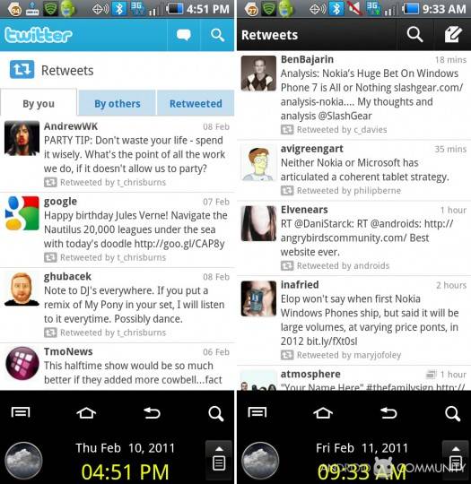
The only bit of the whole app that sticks around no matter where you’re moving around (save for the new tweet screen) is the very top bar (containing the logo, search, and tweet button), making the whole process smooth, visually connected, and completely simple. The app itself moves extremely quickly, never pausing to load once the entire time we were looking at it (and we’re still looking at it, as it’s extremely difficult to close because of how much fun it’s become to use.)
Wrap Up
This version of the Twitter app makes us want to use Twitter even more than we use it now. If Twitter had a dip in users, this would be the app that shot them back into outer space. This version of the app is going to make people stop using third party Twitter apps, making them work harder to create a better Twitter experience – but they’ll be extremely hard pressed to do so.
Grab the app in the Android Marketplace today, it’s free, it’s amazing.
WILL YOU USE IT?
Or will you stick with your current third party Twitter app?






Great review. Just two questions.
1. Does this new version limit you to using just one Twitter account?
2. Is there a choice on what RT style you can use or are you stuck with Twitter’s prefferred method.
Cheers.
so far I think it’s just one account..
as for retweets if gives you a choice.
so far I think it’s just one account..
as for retweets if gives you a choice.
If a twitter app does not maintain your position in the twitter stream, I have absolutely no interest. I cannot understand why the people who make this app haven’t figured out that there are a lot of people like me for whom this is a must-have feature.
Tweetdeck for Android is so much better in almost every way than this app. Maybe version 3 will add maintaining position as an option, at least?
completely agree, I really like the look and feel of the new twitter app, but not remembering your position on the Timeline is very limiting. I don’t check twitter constantly so would miss hundreds of tweets. I love Tweetdeck for that reason!!
I hope the developers take note and add this to an update soon.
I like the new UI a lot but the app is still missing some features I use a lot and it takes forever for avatars to appear. I’m sticking with TweetDeck for now. When I scroll the avatars are already there and don’t slowly pop in.