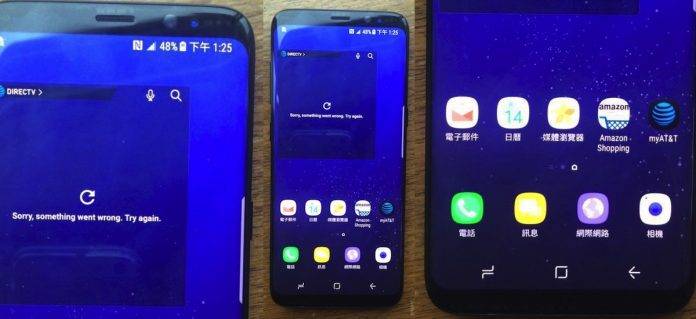
The Mobile World Congress is about to end and we can say there really is no Galaxy S8 on the floor. Samsung made the decision to keep its latest premium flagship phone away from the public’s scrutiny as it is still being tested. We knew it would be shown off to a special group of people in Barcelona privately so we’re expecting some new leaks will be published in the next few days.
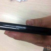
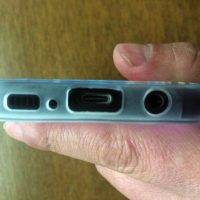
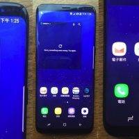
Of course, there are those who won’t be delayed in sharing the good news as evidenced by numerous leaks and rumors but what we have so far is the real thing. Thanks to BGR for posting photos of the Samsung Galaxy S8. It’s the actual device we assure you and not just some press renders.
This is the Samsung Galaxy S8 in its full glory. It is expected to come with a bigger Galaxy S8+ that comes equipped with a 6.2-inch Quad HD+ Super AMOLED display while the S8 will have a smaller 5.8-inch screen. They will look exactly the same but will only differ in the screen size and battery capacity.
Looking at the photos, you’ll say it is very typical Samsung. It looks more like a Note 7 and S7 Edge with the slightly curved and sloping screen on both sides. This one appears to be truly bezel-less simply because of the edges.
Already confirmed is the fact that the Samsung Galaxy S8 will be powered by a Snapdragon 835 (US version) or an Exynos chipset (international). There will also be 4GB RAM, 64GB onboard storage, and a microSDXC card slot expandable up to 2TB. Other features include a 12MP Dual Pixel camera and fingerprint scanner at the back plus a 8MP selfie camera and iris scanner. So it’s true, the phone will have iris recognition just like the Note 7.
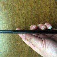
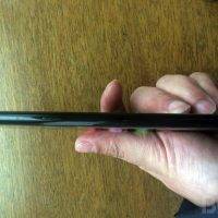
You will notice a new button on the side edge aside from the volume and power buttons. We believe it’s for activating Bixby. There’s still the 3.5mm headphone jack, USB-C port, and speakers on the bottom of the device.
We will see more of the Galaxy S8 duo this March 29 at a special launch on March 29 before the April 21 global release.
VIA: BGR




It’s…. *gasp*…. Hideous.
Like the early eighties thing with over – sized glasses. Fossil-in-amber, it’s horrible and I think they have not learned that they must keep moving forward.
I think what’s happened is that the young team responsible for getting them to the curved screen were then turned into mangers who don’t have the backbone to get the ‘managing’ out of the ‘product.’
It’s screaming – it’s hit all the target dots on the management paper and completely missed the phone.
I think anyway.
The Note 7 was going somewhere .Subtly but it WAS going somewhere.
I think Samsung is going to have to look at the Note 8 very carefully.
My gut tells me that this is going to have a hard time at $1000
It’s hideous.
I’ll just leave this here…..
Tend to agree. I love the look of the 7 Edge, and the Note 7 (especially in Chrome) was very nice (but recalled before I bought it). But this — if it’s real — is boring. Sticking with Pixel.
Not sure how anyone can refer to it as hideous. It’s a phone. Looks similar to the S7 Edge with smaller bezels. I grant you to each his own, but such a strong negative opinion smacks of something….
I especially like–“sorry, something went wrong!” That’s a feature of Samsung that makes it about as user friendly as IOS.
Really beautiful phone.