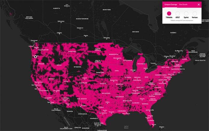
T-Mobile is a company that doesn’t believe in not mentioning its competitors in any of their messaging. They’ve not shied away from calling out AT&T and Verizon over their offers and comparing themselves (of course they’re better in their eyes) to what’s out there. Now you can actually have a visual aid for this comparison, at least in terms of LTE coverage. They’ve added an LTE coverage comparison map in their already existing coverage map on their website, showing that they have better coverage than the other carriers.
The LTE comparison map can be found on their website and of course the T-Mobile coverage is shown by default. You can click on any of the other carriers featured so you can compare and contrast which is better. But also keep in mind that the coverage on the map includes their end of 2017 projection. And of February, they already reported 314 million POPs but they’re expanding to 320 by the end of the year and that’s what’s already shown in the map.
They’ve been bannering that they already cover 99% of the population that Verizon’s LTE network does and since they’re almost at par with them, they decided to have a visual representation of what this means, and also compared to the other two big carriers. But of course these are just in theory and you probably need to be in that place to see if the LTE network does work (and how fast it is).
That part of the website also shows how much T-Mobile has grown in terms of coverage for the past years. You can compare what they were covering as far back as 2014 and until the 2017 projections of course.
VIA: TMO News


