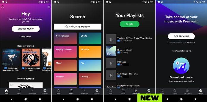
It looks like Spotify may be planning a UI overhaul soon, if things go well for this new thing they’re testing. Some users have spotted a vastly different look for the music streaming app, but it looks like they’re testing it out but only for new users. There’s no news yet if they will be releasing it to regular users anytime soon, but based on what screenshots we’ve seen, it looks prettier and more colorful than the one we have now, so hopefully this will make its way to our Spotify apps soon.
Some folks over at Reddit posted about the new design but as stated, you can only see the refreshed UI if you sign in with a new account. But when you switch back to your actual account, then you’re left with the boring old current UI (okay not really boring, but compared to the new one, the present one seems old). The screenshots show more colorful backgrounds (maybe even to match your phone’s ambient background?) and colored boxes to show different genres.
If you want to see the new UI for yourself, delete the Spotify app on your device or you can also log out then clear your cache and saved data. But it’s easier if you just delete the whole thing if you don’t like logging out of things. Then download the Spotify app and reinstall it. You have to create a new account to log in so you can see and play around with the new UI. But if you want to go back to your old account, say goodbye to the new look as you’ll revert to the previous one that you’ve been using.
As long as we don’t get an official announcement from Spotify, we can just assume that they’re simply testing out this UI to see how people respond to it.
VIA: SlashGear


