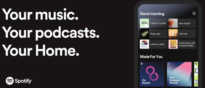
Spotify is probably one of your most-used apps on your smartphone or tablet. Now they have updated their home screen so it would be easier for you to get to the playlists and podcasts that you listen to the most. The refreshed user interface puts the favorites at the top of the page so you can “quickly jump back into familiar content”. They are placed in a dedicated space at the top of Home and then all the other top podcasts and music recommendations as well as personalized content.
Once you’ve updated your Spotify smartphone and tablet apps, you’ll see the playlists you’ve been streaming lately or the podcasts you’ve been listening to every morning. There are six slots reserved for it at the top. The content actually changes along with the schedule, so you’ll see a “Good morning”, “Good afternoon”, “Good evening” greeting and the algorithm will match what you usually listen to at the time of the day.
Under that favorites section, you’ll see the other sections like Podcast Recommendation, Recently Played, Your top podcasts, Made for You playlists, Recommended radio, etc. Of course, all these are based on your listening habits and Spotify’s algorithm. They say this new home page does the “hard work” so it can be easier for you to find things to listen to, both the ones you already listened to and liked or if you want to discover new things.
Having Spotify choose your music for you can be both a good thing and a bad thing. Good because you don’t have to go and painstakingly create playlists (unless it’s something you really enjoy) but you’re also, of course, subject to what Spotify wants you to listen to although it is based on what you’ve been listening to as well. But having your Favorites more accessible should be more helpful than the previous UI.
The new Home user interface should be available on the Spotify app on your Android smartphone and tablet. If you’re not seeing yet, you can wait as the update might be taking a few days.


