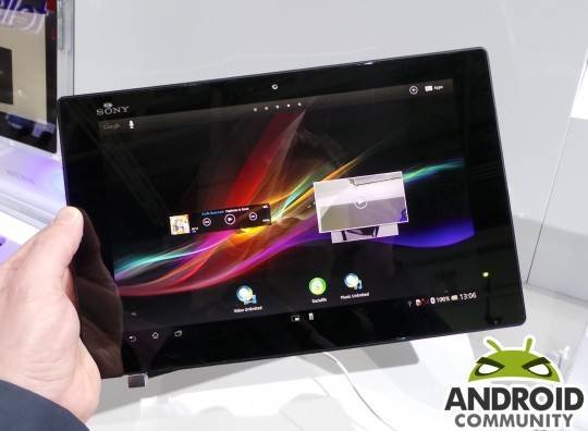
Sony has been busy lately with updates. Showing that the company can keep up with Samsung and the rest by offering timely updates to the latest version of Android. They recently pushed out OTAs for their newest Xperia phones, and now we’re seeing the Xperia Tablet Z get Android 4.2.2 Jelly Bean this week. Hopefully 4.3 isn’t too far behind though.
While not all versions of the slate are getting this today, we’re seeing multiple reports that the LTE model SGP321 in parts of Europe have received Android 4.2.2 OTA notifications as of late. Not only is the Tablet Z getting a new build of Android, but Sony’s switched up the UI a bit too.
We’re hearing they’ve centered the soft touch on-screen navigation controls, instead of leaving them off to the side. Then the notification bar has been moved back to the top right like their smartphones, same as the notification pulldown bar. Instead of all on bottom as shown in the image above.
There’s probably a few other changes we’ve not yet noticed, so if you’ve got the update drop us a comment below. So far other regions as well as the WiFi model have yet to see an update to 4.2.2 Jelly Bean, but that should be coming soon. Stay tuned as we’ll update the minute it starts rolling out.
VIA: PocketDroid


Current update for Tablet Z actually reduced my satisfaction factor. Centering navigation controls completely ruined user experience. As now by holding tablet in two hands, you cannot comfortably reach any of those navigation buttons. Another thing is notification bar – it lost convenient controls (e.g. brightness), and moved it to top! It was way much more comfortable before this update 😐
Hi i’m from Bulgaria can you tell me when this update will come here?
UX I agree with you 100% .
Sony please return the old UI!!!!
My thumbs cant reach the center buttons on landscape mode, why isnt this user selectable…also what happened to the display brightness, it was in the drop down menu, now I have to go to settings and make a change, I am often inside and outside, and do not use the auto brightness. Anyone else see any positive changes to the update?
This new UI makes the device incredibly cumbersome and frustrating to use in landscape mode. It feels like I’m holding an over-sized phone, when before it was a sleek tablet. I preferred the small notification window in the bottom right corner, there is no option to choose what layout the customer wants.
I emailed Sony support a week ago and they still haven’t even replied!
Usability lost…. Downgrading