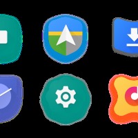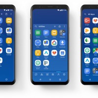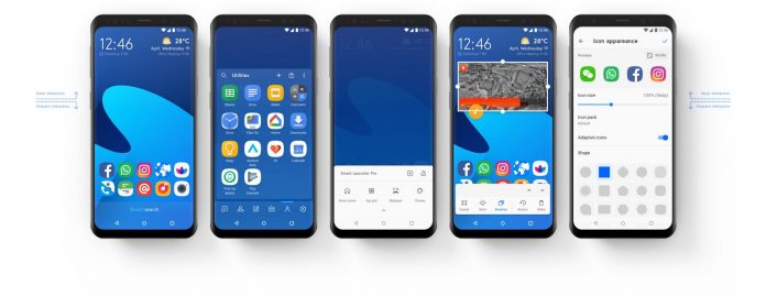
We’re used to getting a couple of new features every once in a while from app updates. But sometimes the developer also brings the changes all in one go with a major update. Smart Launcher’s latest update to version 5 is actually two years in the making and they have redesigned everything about the app from scratch, from the design to the UI to the features. Over 200.000 lines of code have actually been changed so expect to be bombarded with changes (hopefully, for the good).
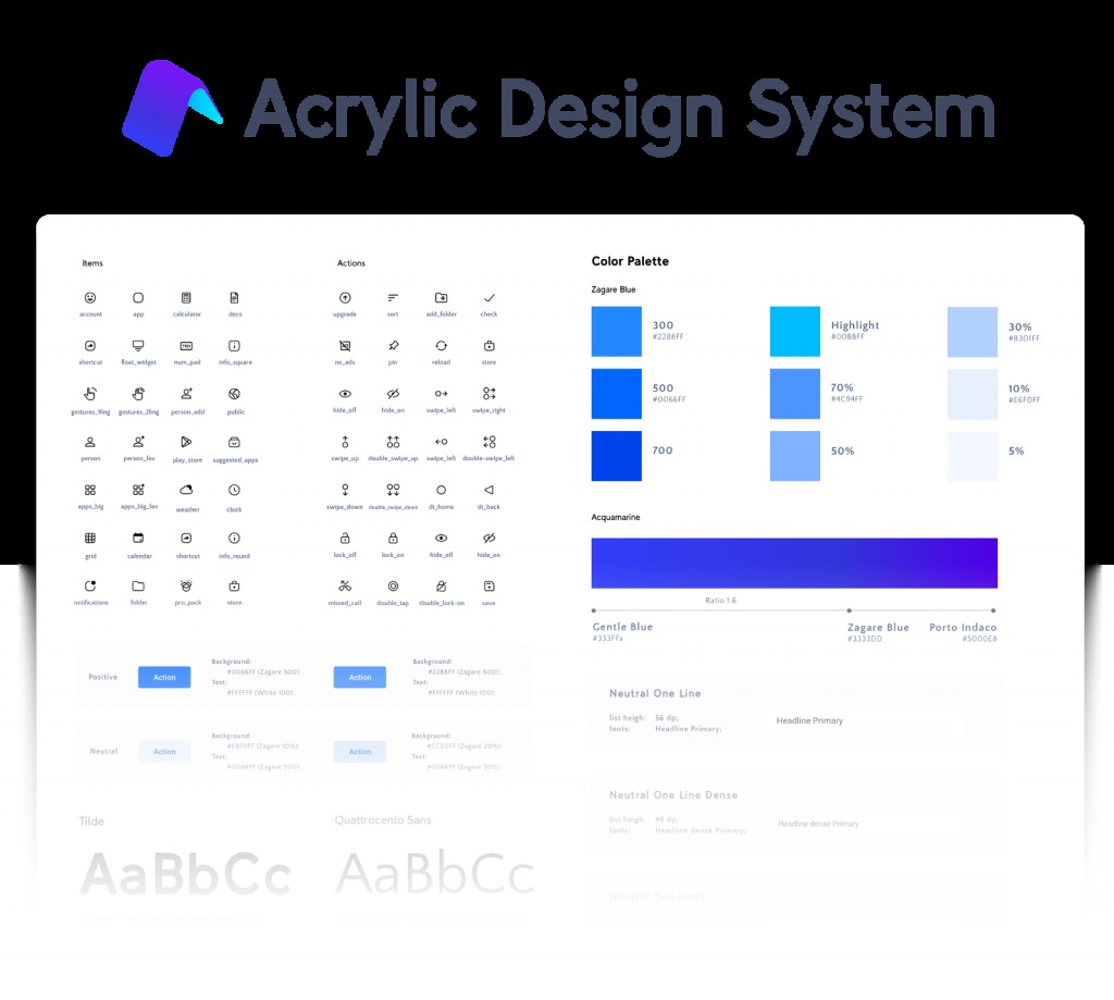
The short story of the design changes is that since devices’ dimensions have changed since two years ago, the items at the bottom are the things that you interact with the most while the upper part of your screen is for the information and visual content. They have also created a new unified visual language which they’re calling Acrylic Design System which is basically their guide for styles, components, etc so that the look and feel of the app are consistent.
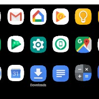
As for the new goodies that you’ll encounter, there are a lot to explore and appreciate. You have ambient themes to match your wallpaper color and adaptive icon backward compatibility (based on the adoptive icon of Oreo). The search bar is now more accessible at the bottom of your screen. You have three drawer layout options for the category bar: on the side, on the bottom, or disable it completely. The built-in clock widget now has your alarm, your next event, and even the weather.
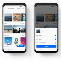
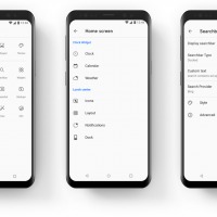
You can also choose the freeform widget mode so you can resize and move your widgets freely. Even your preferences page has been redesigned with a UI that’s easier to read and understand. You also have more choices for your wallpaper and you can arrange your app icons by color. The update to Smart Launcher 5 is rolling out to beta testers and if all goes well, the stable version will be released in March.
SOURCE: Smart Launcher


