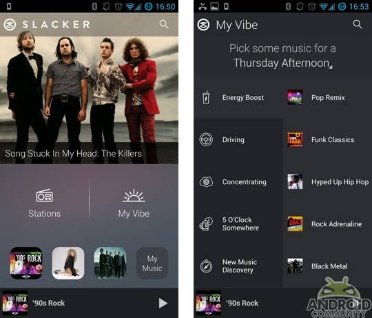
Slacker Radio was bumped to v4.0 back in February and it looks like the next major update is hitting the Play Store today. This latest update brings a new look and feel as well as a new feature called My Vibe. And looking back to that v4.0 update, this v5.0 update is another that is bringing a noticeable difference in terms of the looks.
The Slacker Radio app is leaving behind the white and blue in favor of a darker color scheme. Perhaps more important though, this new look is also coming along with some easy access to your recently played music. It now includes quick access to four recently played stations along the bottom. In addition, you will also notice options for Stations and My Vibe.
The Stations option is something that Slacker users are likely already familiar with. This basically just takes you to the long list of available stations offered by Slacker. The My Vibe option is something new. This offers the ability to listen to stations based on your mood. For example, Slacker has some pre-set categories for items such as Energy Boost, Driving, Concentrating and more.
Of course, changes to the app aside, the service as a whole remains the same. Simply put, you can still download the app and listen to music for free. There are some limitations for free users, such as advertisements, but those looking to avoid those and gain some extra perks can choose to become a paid subscriber.
Slacker has paid options available for $3.99 and $9.99 per month. For $3.99 you can ditch the ads and the skip limitations are removed and for $9.99 you get on-demand listening as well as the ability to cache music for offline listening and more. With that, the latest version of Slacker for Android can be found in the Google Play Store.


The Windows Phone-esque Slacker 4.0 UI was so terrible I pulled the old apk off of my Evo 4G to put on my Nexus 4. We’ll see if they came to their senses this time.