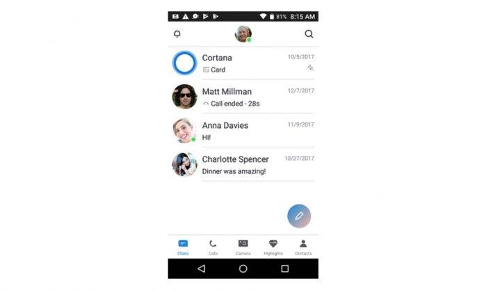
It may not seem like a lot, but little design tweaks in an app can sometimes make a huge difference in how people use and interact with your product. That’s probably one of the things Microsoft is thinking about as they test out a few new things on the Android version of the app, after updating the iOS one a few weeks ago. This includes adding a bottom bar and putting a contextual spin to the Floating Action Button. They’re also adding a SuperComposer that users in the beta program can test out.
This experimental version of the Skype app is based on early testing where users expressed a preference for some of the tweaks made. The bottom bar for easier access to the core features of the app was popular and so they’re testing it out once more, this time for the Skype Preview program users. They’re also bringing back the contextual FAB so you can add or do things easily, depending on where you are in the app. They have also updated the header and search icon to make it more Android. The tweaks also follow the Material Design guidelines.

Another new thing they’ve added is the SuperComposer feature which comes with the FAB button. When you tap compose, it will bring up things like your recent contact list, creating a new group, search bots, add a contact, invite to Skype, make a call, etc. The idea is to make it quicker for you to do things while on Skype without having to go through a few extra steps.

To test out of all these, get the Skype Preview app from the Google Play Store if you haven’t yet. Otherwise, you’d have to wait for them to come out to the stable version.
SOURCE: Skype


