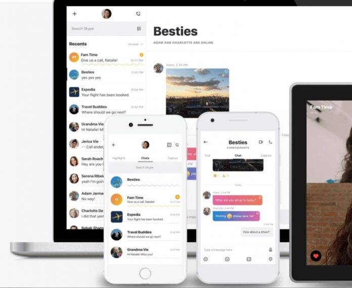
With all the messaging apps that are available in the market, which offers you free messaging and voice and sometimes video calls, you might wonder why you would need a sort of antiquated service like Skype. Well, Microsoft has figured out that fact and so it’s not that a surprise that they have overhauled not just its look but practically the whole personality of the app. They have officially unveiled the next generation of the app, and it seems like we’re looking at another Snapchat-like messaging app.
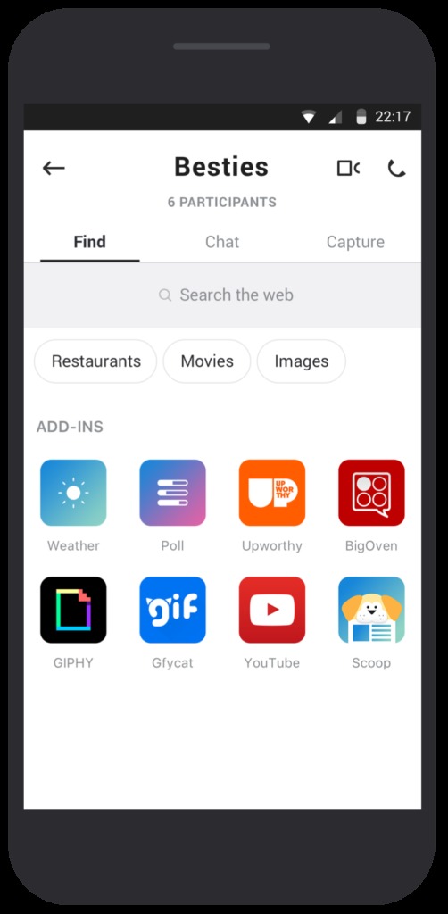
The app is now divided into three different sections: Find, Chats, and Capture. The first section will let you look for the conversations you have or look for things to add to your chats, like images, restaurants, plus other app add-ins like YouTube, Giphy, etc. Chat is where you, well, chat with your contacts and loved ones. The Capture section is probably the newer of its features and the most similar to Snapchat. When you tap it, it will go to the camera mode and once you take a picture or video and then add stickers, text, or annotations, just like what you can do with a lot of messaging apps now.

The social media-like component of Skype is the Highlights feature where you can post a stream of photos and videos that your contacts will be able to view. They can also react with the appropriate emoticons, even during your text and video-based conversations. The Find feature is also where you will be able to use bots to make conversations easier and more fun as well.
The redesigned app is available for mobile first, specifically for Android. It will then roll out to other platforms, desktop included. Let’s see if they will be able to reclaim a portion of the messaging market. It also remains to be seen if those who use Skype for business will still stay with them with this redesign.
SOURCE: Skype


