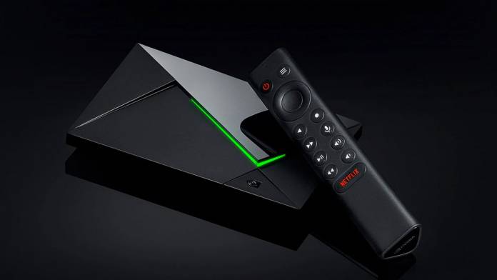
Nvidia Shield TV streaming video box is one of the best you can get, and the Android TV updates have been accepted well by the users. That however cannot be said for the latest update which brings a new interface to the premium streaming box. The Android TV update with a new interface to the homescreen has brought ads disguised as curated content and the users are understandably furious over this development.
The rollout dubbed as the Android TV “Discover” homescreen arrived last week for Shield TV owners. The Discover tab is there to find new content based on interests with rotating screenshots of the TV shows or movies.
Some of these slots are organic as they are picked by Google’s algorithm while a few of them are sponsored slots. If the one star reviews for the app noticed were not bad enough, this has added fuel to the fire.
Geeky users have been so frustrated by this new update, they have replaced it entirely with their preferred solutions. On the other end of the spectrum, normal users have not taken much notice of it and were more bothered with the privilege of Apple TV+ support landing on the platform.
Google says these recommendations for streaming content are based on the user’s interests, but keen Shield TV users point to a valid fact. The recommendations show content they haven’t even subscribed to which has added to the irks with the already one-star reviewed app.
A number of users have complained that the app’s minimalist design has been unnecessarily tinkered. The banner ads interface disguised as content discovery interface is not acceptable when considering the service is premium – going anywhere from $150 to $200 depending on the model chosen.


