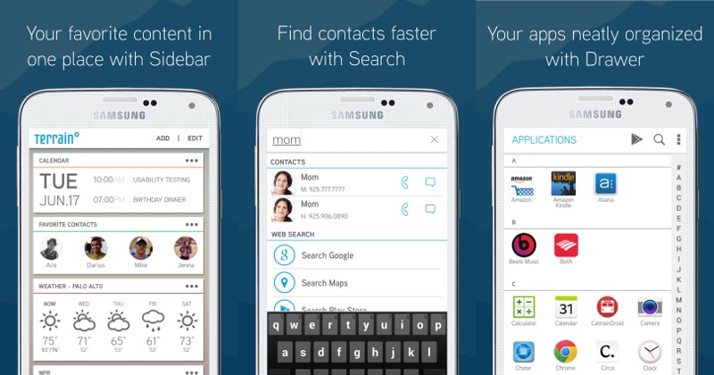
Samsung has its own TouchWiz homescreen exclusive to its smartphones so it comes as a bit of a surprise to see a new homescreen launcher replacement that has been funded by the manufacturer’s startup accelerator. But will Terrain Home actually be able to make a name for itself in the crowded homescreen marketplace? Perhaps it could, if the subset of features it seems to have picked off from other launchers resonate with you.
Aviate without the brains. Fasthlane without the tiles. Everything.me without the recommendations. GEL without Google Now. It is almost hard to pin down Terrain Home to a single description because of the mix of features that it possesses, some of which seem to be inspired by other homescreen alternatives. But Terrain Home bills itself as a launcher that simplifies your smartphone by putting everything in a single place, and to that extent, it might have actually succeeded.
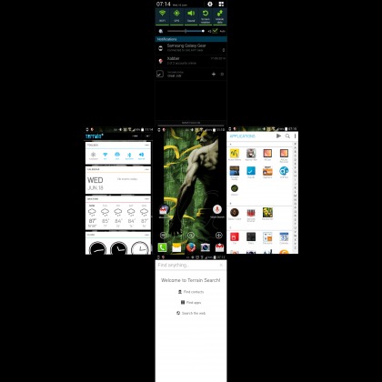
The two core features that Terrain Home is selling users is Search and Sidebar, though those two are, ironically, actually not front and center of the homescreen. By default, your homescreen will actually look like any other AOSP-based homescreen, Trebuchet or Google Experience Launcher, except for three rather new and conspicuous icons above the dock that also take you to the launcher’s main features.. However, all the main features of the launcher is just a swipe gesture away. Swiping up will take you to Search. Swiping to the right will bring up the App list. Going the opposite direction will land you in Sidebar. And to keep things balanced, swiping down will unroll the Notification panel.
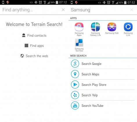
The Search feature is brain dead simple. Search-as-you-type will show up results coming from your Apps and Contacts, but if you want to do more, you can tap to search on Google, Maps, Play Store, Yelp, and YouTube. It is a bit like Everything.me’s pervasive search functionality, except it isn’t the core focus of the launcher and it doesn’t make smart recommendations. It is also a bit like Google Search or Google Now, minus the voice recognition part. And speaking of voice, it is quite interesting that, by default, Terrain Home puts a homescreen shortcut to Voice Search instead of Samsung’s own S Voice equivalent.
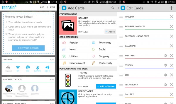
Compared to Search, the Sidebar is more active and more dynamic. This feature is like a mishmash of cards from Google Now or Aviate and dynamic content from Nokia’s Fastlane. In fact, Terrain Home does call them “Cards”. Here you can edit cards, add some, remove some, or rearrange some. Cards range from static content like Toolboxes for the most commonly used settings to forever changing ones like a Facebook feed, Weather, News, and even a world clock. There are different categories of Cards you can choose from, but it is a limited list. There will be noticeable things that are missing, like Email, Messages, Twitter, or Google+. The good news is that these cards are practically just Web apps and Terrain Home will soon be releasing an SDK for developers to add their own cards. Whether or not they will have to submit those to a curated Card store is still unknown.
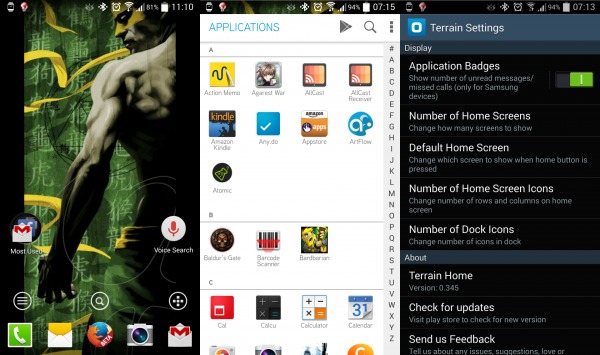
The center homescreen might look plain and simple, but as the adage goes, looks can be deceiving. That space is surprisingly quite customizable, unlike other launchers that curtail your freedom in exchange for their own unique paradigms. Here you might see some resemblance to AOSP or Trebuchet, where you can set up a wallpaper, add widgets, and group shortcuts into folders. You can even add more homescreens if you wish, though that will naturally require more swipes to get to the Sidebar or the App list on the right, which looks eerily a lot like Aviate’s. But Terrain Home goes beyond that. You can actually configure the number of rows and columns that will make up the homescreen grid, and even increase the number of dock icons to a maximum of 7.
https://www.youtube.com/watch?v=k-msK5k_2Ko
Terrain Home, however, is far from perfect. Those used to smart contextual features from Aviate or Everything.me won’t find it here. The voice-activated trigger of Google Now Launcher is also nowhere to be found. It also strangely disables the menu button of devices, relocating such functionality to a long press on the home screen or the App list overflow menu, breaking standard Android conventions. Terrain Home, however, remains an interesting and fresh option for those who won’t feel the loss of the features too much. But best of all, it is free and isn’t exclusive to Samsung devices. Theoretically, it should work with and any Android device running Android 4.1 and later, though exact availability and compatibility might vary.
Download: Terrain Home on Google Play Store
SOURCE: Terrain Home


Something is seriously wrong with your site….Assume you know, but just in case. Unreadable gray text on blue background. Hope to see it fixed soon.
Brian, can you send us a screenshot to support at androidcommunity.com Thx!
Not compatible with nexus 7…