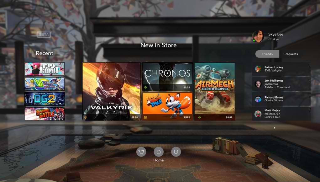
The Samsung Gear VR is probably one of the most affordable and user-friendly virtual reality headsets you can find in the market. But there is of course always room for improvement. And this latest update to its software is bringing a much needed revamp to its Home screen. Users will now get an Oculus Home experience that is much more similar to the look and feel of the Oculus Rift, the more high-end headset from the same company that Samsung has partnered with to make the Gear VR better.
The Oculus Home is basically your Gear VR’s home screen and the first thing you see when you put on the headset. It has a sort of app drawer and you interact with it by tapping the button on the side of the Gear VR. The update has now made it more like the Oculus Rift home screen, with a much cleaner and more spacious layout and a more fully-featured menu.
What’s missing in this update is the “friend” section that can be see in the Oculus Rift home, which allows users to have a user-to-user interaction and allow them to socialize with other Gear VR and Oculus headset users. That may be something that will come up soon as Samsung seems to be content to let Oculus “keep running the show” at least in terms of the Gear VR’s software.
Samsung is one of the companies that is serious about pushing virtual reality to consumers, instead of it just being a cool thing that people can admire but not actually use. We actually look forward to see what other VR offerings Samsung and other OEMs will continue to bring to the market.
VIA: Road to VR


