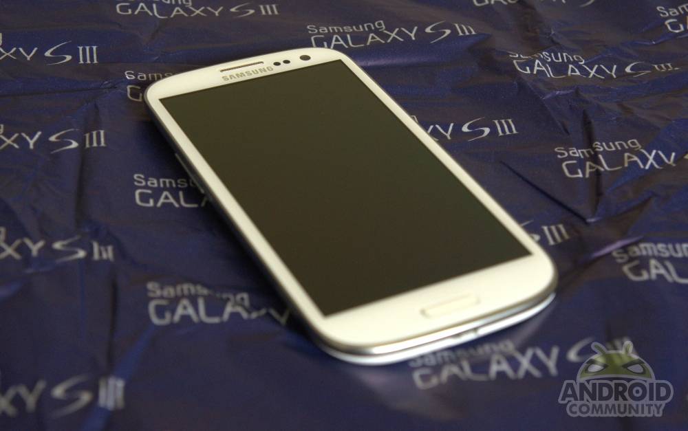
It’s hard to think of another product – other than the iPhone – that’s had so much hype built around it. Rumors swirled the Galaxy S III for months, with leaks, renders, and reports coming from all corners of the globe as to what the sequel to the Galaxy S II might hold. The South Korean manufacturer did fall foul in its attempts to try and capitalize on the situation with its misguided “iSheep” campaign leading up to the May reveal, but the excitement was still palpable as we were ushered into the Earl’s Court Exhibition Centre. We came away from that event with mixed feelings regarding the marketing and message of the phone, not to mention the device itself, but what about now? We’ve had a chance to spend some quality time with Samsung’s flagship handset for 2012, and can finally divulge our opinion.
Design
When we first handled the Galaxy S III back in May, it was hard to try and swat away negative feelings. Granted, we took all the rumors of a ceramic (or possibly even metallic) construction with a grain of salt, but an air of disappointment lingered after our brief exposure to the device for a few good reasons. Do we feel any differently now that we’ve spent some more time with the device? Yes and no.
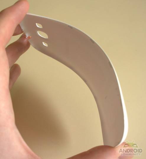
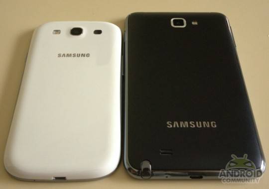
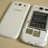
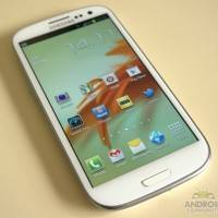
Let’s get the most controversial point out of the way: yes, this is a polycarbonate build, just like you’ll find on the HTC One X and Nokia Lumia 800 and 900, but Samsung has chosen to go a different route with the look of the phone. While HTC and Nokia’s devices opted for a matte finish, Samsung has instead chosen to apply what it calls a “Hyperglaze” coating to the premium plastic, giving it an appearance that really isn’t too far removed from the original Galaxy S. That’s disappointing. Yes, the device has a solid build quality, and phones constructed from glass and metal are particularly susceptible to permanent damage, but the fact remains that it looks like a horrifically cheap device compared to the One X and Lumia 900.
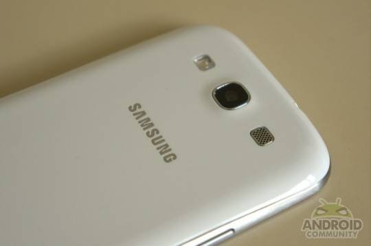
Things aren’t too bad if you’re looking at the phone from the front. In fact, it looks quite pleasant. Gone are the bulky corners and square construction of the Galaxy S II, instead replaced with a curvy exterior with cues borrowed from the Galaxy Nexus. The back is when it all starts to fall apart, with the Pebble Blue model of the phone trying to trick users into believing more premium elements are at play. Why dangle the illusion of a brushed metal back in front of users, particularly when that shade of blue magnifies fingerprints, grease, and smudges?
[The above video mentions that the power button is on the left hand side of the phone with the volume rocker on the right. It’s actually the opposite, and we apologize for the error.]
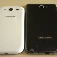
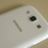
Still, the Marble White version that was handed to reviewers does look much better. Gone is the faux metal look from the back cover, with a smooth and consistent white covering the front and rear of the device. Unfortunately, Samsung has chosen to keep the faux metal silver trim running along the edge of the device. To the company’s credit it’s a relatively subtle effect, and not absurdly shiny like on cheaper phones, but we’d prefer it not being there at all. While the white back won’t reveal fingerprints and smudges quite so easily, use the phone long enough and it’ll begin to feel slippery, with regular wipe downs needed to remove the “yuck” factor. We took it for granted on the Galaxy S II and the Galaxy Note, but we would have liked to see the fine texture on those devices make a return.
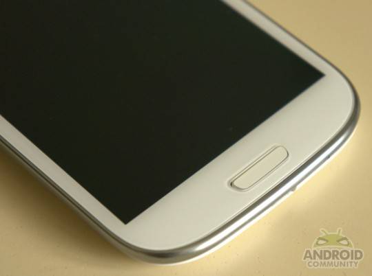
The rounded corners and lack of hard edges around the device, plus the lack of a “hump” at the bottom to accommodate cell radios, does mean that this is a phone that rests comfortably in your hand. The lip that surrounded the screens of the Galaxy S II and Galaxy Note has also been removed, meaning your fingers can slide effortlessly off the edge of the screen without meeting resistance, which, simply put, feels fantastic.
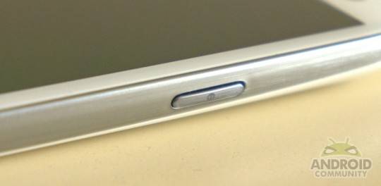
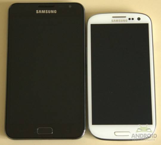
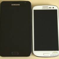
There is a “but”, as there always is: the phone is too big for this particular reviewer. It simply isn’t feasible to use the phone with one hand in everyday scenarios. When you’re not straining your wrist and thumb trying to hit UI elements or the physical hardware button at the bottom of the device, you’ll be shifting the handset around in your hand, literally trying to get to the grips with it. The Galaxy Nexus was already hitting the practical usable limits thanks to its 4.65-inch screen, although that phone was slightly easier to use thanks to the presence of on screen buttons. The increased size of the 4.8-inch screen coupled with the physical hardware button (plus two capacitive keys) is simply too much. If you have larger sized hands than average, you’ll probably feel right at home with the device, but for everyone else we recommend you try and get a hold of a demo unit before committing to such a large size for two years.
Hardware
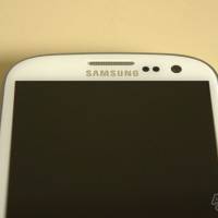
Even if you’re not partial to the design of the Galaxy S III, it’s hard to argue that the phone packs the best specs you can cram into a smartphone right now. A quad-core Exynos 4212 processor clocked at 1.4Ghz is joined by 1GB of RAM, an eight megapixel camera with 1080p video recording, 16GB of storage with options for 32 and 64GB, plus a microSD card slot. All in all, the phone’s screen measure 4.8-inches diagonally, featuring a Super AMOLED HD panel with a 1280×720 resolution. Next to the speaker grill and Samsung logo, you’ll find a multi-colored notification LED, along with ambient light sensors and front-facing 1.9 megapixel camera. Everything is running on top of the latest version of Android, Ice Cream Sandwich.
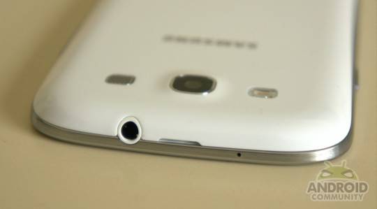
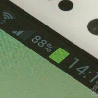
Is PenTile a problem anymore? From a normal viewing distance, no. In fact, this is the best an AMOLED panel has looked to date. Traditionally such displays skewed whites towards blue out of the box, even when viewed head on. Samsung seemed to tweak color balance on the Galaxy Nexus, and has further done so here on the Galaxy S III. Whites finally look white when viewed straight on, but the familiar blue tint will return once you start to shift the handset around in your hand and towards different angles.
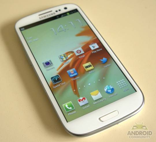
As for color saturation, Samsung still seems content to set the phone to “torch mode” out of the box, with oversaturated colors aplenty. It’s not quite as absurd as phones of the past, and we understand the need to make the display “pop”, but we could do without it. Luckily, Samsung has included the same color profiles that it debuted on the Galaxy S II and the Galaxy Note. In fact, there’s four modes here: Dynamic, Standard, Natural, and Movie. Standard is what the phone is set to by default, with Dynamic really ramping things up, and Natural/Movie toning everything down. In the end, we were happy leaving the phone on Natural for general use and video playback.
The lack of a third sub pixel does come into play when you hold the phone closer to your eyes, revealing the tell-tale PenTile signs. Again, it’s not a problem in everyday use, but as the phone is the first thing we look at when we wake up in the morning (closer than we would normally view it as well), it does become noticeable, and can’t be unseen once discovered. Even ignoring the PenTile issue, the display just doesn’t quite have the same “wow” factor as the laminated screen on the HTC One X, or the Retina display on the iPhone 4S, both utilizing IPS panels. Yes, you get inky blacks with the Galaxy S III, but color balance is never quite right even after fiddling with settings, especially on lower brightness settings.
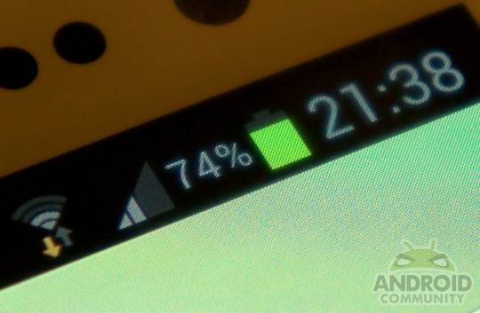
Speaking of brightness, the “auto” setting on the Galaxy S III is far too aggressive, a problem seemingly carried over from the Galaxy Nexus. It looks to be have been done on purpose too, with the screen proving quite the battery hog once you crank the brightness, so it makes sense Samsung would try to be conservative and squeeze as much out of that 2,100mAh battery as possible. Be that as it may, the auto brightness setting is broken as far as we’re concerned. The display is far too dim and practically unusable in regular use, nevermind under a glaring sun. You’ll have to manually manage brightness if you want to get the best out of the phone.
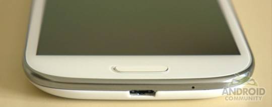
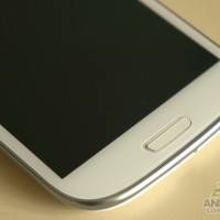
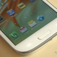
Samsung has decided to stick with the familiar one physical button and two capacitive key arrangement, and while we’ve grown accustomed to the use of on screen buttons with the Galaxy Nexus, it seems that OEMs are quite happy sticking to physical keys. We had no problems with Samsung’s physical home button, appropriately clicky and somewhat firmer to press over the Galaxy S II and Galaxy Note, although the smaller size took a bit of getting used to.
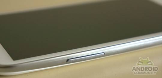
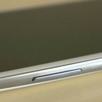
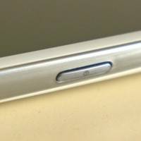
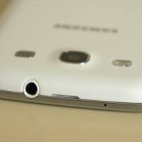
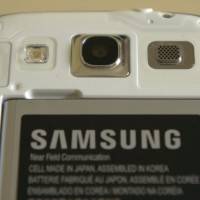
The power button located on the right hand side of the device is placed nicely, easily accessible with the thumb and featuring a nice depress. The same can be said for the volume rocker located on the left hand side of the phone, although we ran into a couple of occasions where we found ourselves accidentally pressing both the power and the volume at the same time. That’s more a case of our butter fingers than Samsung’s rocker placement, but it’s something to be mindful of. On the top of the handset you’ll find the 3.5mm headphone jack and a microphone, plus the small slot that will allow you to pry the plastic cover from the phone. On the bottom, you’ll find another microphone along with the microUSB port.
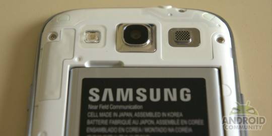
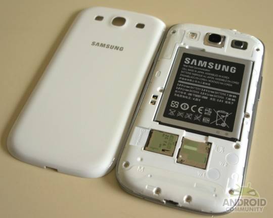
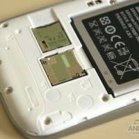
In terms of additional specs, Samsung really hasn’t left anything out. Our review model came with 16GB of internal storage, with around 11.2GB accessible free for your own content after formatting, OS space, and app allocation. Samsung saw fit to include a microSD card slot underneath the battery cover, a move we support 110%. OEMs seem to be moving away from microSD without providing enough internal storage space, so we applaud Samsung for keeping the expandable storage option. You’ll be able to slam a 64GB card in there, and coupled with the maximum internal storage option of 64GB, plus USB OTG functionality, power users won’t be left wanting for storage space.
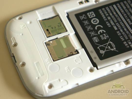
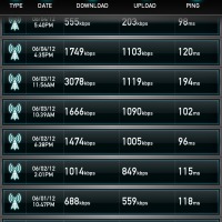
While the international Galaxy S III has support for HSPA+ up to 21Mbit/s, the versions that will be sold in the United States will offer different capabilities. Verizon, AT&T, and US Cellular will all offer an LTE equipped model, while T-Mobile will eschew that for its own “4G” in the form of HSPA+ speeds up to 42Mbit/s. GPS, aGPS and GLONASS are all supported by the phone, as is Bluetooth 4.0 along with the apt-X audio profile. That will allow higher quality audio to be piped over Bluetooth if you have a compatible headset, and 4.0 means you’ll be doing so with reduced power requirements. An FM radio has also made it along for the ride, which you’ll need to use with headphones plugged in to serve as an antenna. NFC support is included too, built into the battery like the Galaxy Note and Galaxy Nexus.
Software
We’ll never been big fans of TouchWiz. Samsung’s custom user interface was garish, cartoonish, and a generally unpleasant experience. The company made a lot of noise during its May event, saying how the rejigged UI was “inspired by nature”, dubbing it TouchWiz Nature UX. We wouldn’t go that far, with very few elements bearing such inspiration.
The most obvious, however, is the lock screen. Touching it repeatedly will generate ripple effects along with a sound effect that sounds suspiciously similar to the one made when swimming underwater in Super Mario Bros. Swiping will produce even more ripples, with enough force unlocking the phone to a trickling sound. We never felt quite at ease with such sounds, with them coming across as silly and unnecessary.
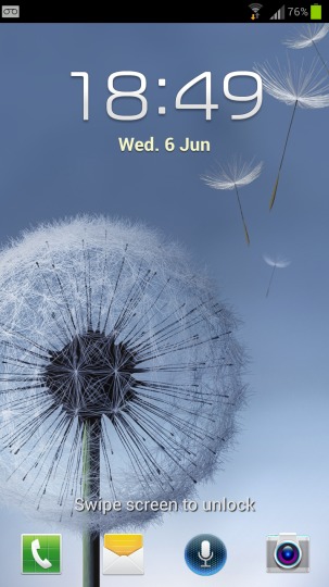
Things do improve from there. In fact, we were surprised at just how much Samsung has tweaked TouchWiz for its outing on Ice Cream Sandwich, with it being quite the departure even from the version found on Ice Cream Sandwich ROMs for the Galaxy S II and Galaxy Note. Icons and UI elements have been tweaked, reigning in any cartoonish elements and instead offering a more subtle look. Spacing has also been tweaked, with gaping chasms between apps and icons that makes the whole OS feel more roomy compared to the TouchWiz of old. Even the clock widgets have received a makeover, with the new ones found on the Galaxy S III proving slicker with a futuristic twist.
Fonts have also been tweaked, with names hugging the app icons much more closely. Place an app shortcut on one of your homescreens on the Galaxy Note, and you’ll find an ugly grey bubble laying beneath the white text of the app name. Not so on the Galaxy S III, with just text popping up providing a much cleaner look. Pop up all your installed applications on the Note, and your background will practically be blacked out. The wallpaper on the Galaxy S II, meanwhile, it still clearly visible. The app drawer has also borrowed some flair from Ice Cream Sandwich, with apps and widgets being placed in two separate categories, and an icon in the top right corner will allow you to jump straight to your downloaded apps.
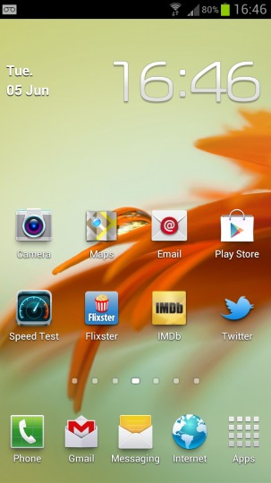
If you’re hoping to see other such features borrowed from stock Ice Cream Sandwich, you’ll be in for a disappointment. Bizarrely, you can’t simply drag apps on top of one another to create folders. Instead you’ll have to hold down on your homescreen, select “Add to Home Screen”, then “Folder”, a needless set of extra steps. Still, there are other useful additions. The quick toggle icons are back at the top of the notification drawer. Five options are initially presented, including WiFi, GPS, Sound, Screen Rotation, and Power Saving, and a swipe to the left presented yet another five: handy.
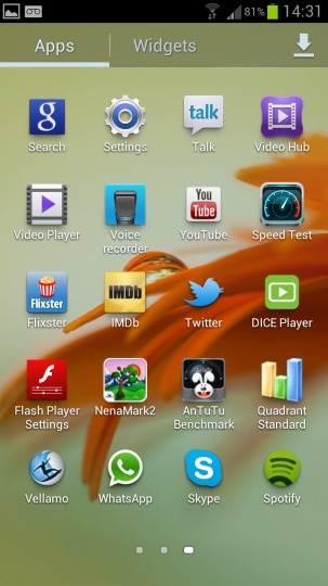
One thing that did bug us about this was the presentation of the widget. When you pull down the notification bar, the set of icons moves to the right to indicate to the user that two rows are in play, but it repeats the animation every single time you swipe down the bar. It’s the kind of thing you’d imagine would only be presented upon the first boot, and becomes frustrating as you learn the positions of each icon and muscle memory takes over. That animation then gets in the way if you’re too impatient to wait for it to finish, occasionally leading to a mistap. Nitpicky? Maybe, but it seems strange to us.
New widgets include an assistive light that will turn on the camera torch in dark environments, a video player that can load up clips directly on the homescreen, S Memo notes that have been aped from the Galaxy Note along with multiple S Planner widgets, Samsung’s Game Hub, and Flipboard. That exclusive app is present on shipping retail models, although it’s not so exclusive anymore now that Flipboard has released a beta APK for other Android owners to enjoy.
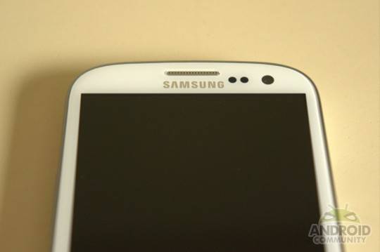
Other bundled apps include Dropbox, which offers 48GB of free storage for two years when you sign into the service on the phone. Samsung has also included its own ChatOn messaging cross-platform messaging service, along with a Game Hub, Music Hub, and Video Hub. The content on each of the stores isn’t worth mentioning, with high prices and generally slim pickings to be found when you dive in.
Let’s talk about Samsung’s onscreen keyboard for just a moment. While the design and spacing is very similar to the stock Ice Cream Sandwich keyboard, the auto correction and word prediction drove us crazy. It’s far too sensitive, correcting and replacing words before we’d even had a chance to finish. We had no problems typing on the keyboard at all, but trying to battle with an aggressive algorithm is frustrating to say the least. Once we’d turned it off, all was right with the world, but it’s something to take note of.
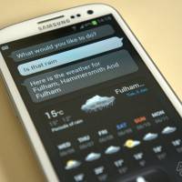
The most talked about app on the Galaxy S III is S-Voice, Samsung’s voice recognition assistant powered by Vlingo. A lot has been said about S-Voice, but let’s cut to the chase: it’s doesn’t work very well. The phone prompts you to say “Hi Galaxy” to wake it up, but you’ll find yourself awkwardly saying the phrase repeatedly while the phone stares back at you blankly. It’s quicker to simply tap the microphone button. When S-Voice does spring to life, questions and phrases are often misheard, when the service even works. Often we found ourselves at the mercy of a network error, and when requests were being pushed through it was done so extremely slowly, even on a speedy WiFi connection.
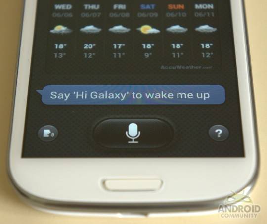
When the service works, you have to sit back and wonder why you bothered in the first place. It’s just so cripplingly slow: any function that you want S-Voice to perform you could have done yourself three times as fast. It’s an awkward and half-baked implementation. The voice recognition could be improved over time, but consumers are buying the phone today, and at this point in time it’s a poor feature that isn’t worth using.
How about Smart Stay? Again, it works, but it can be very inconsistent. Understanding how the implementation works is probably the key to properly utilizing the feature. When you enable Smart Stay, the phone’s front-facing camera will occasionally check for the presence of your eyes to make sure you’re still looking at the screen, keeping the display lit without you having to touch it. The feature seems to revolve around your screen-off set time. Let’s say you’ve set the display to automatically turn off after 30 seconds: Smart Stay will check every 15-20 seconds to make sure you’re still keeping an eye on things. Bump that to a minute, and it starts to check every 30-40 seconds. Generally then the feature is taking the timeout time and roughly halving it before performing a check.
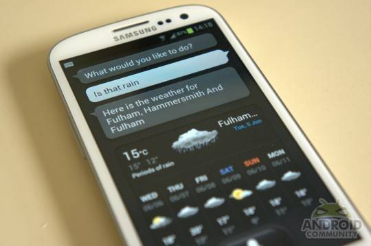
In a well-lit room with the handset directly facing our visage, the feature working without any issues. In darker scenarios, or off at angles, then you’ll be met with mixed success. Is it a feature we could see ourselves using? Probably not, but it’s at least an interesting attempt at something a little different, unlike S-Voice.
Another dubious feature is the ability to take a currently playing video from the bundled player and pop it out into a new window. Samsung calls it Pop Up Play, although you’ll be more familiar with the Picture in Picture term. Once you pop out the video from the player, you can freely manipulate it around the homescreen, browser, or any app that you’re running, allowing you a degree of multitasking. There are two drawbacks to the function, however. First, you can’t expand or shrink the video window: you’re stuck with one size. Second, you can only use the feature with locally stored content on the phone, so any YouTube or Flash videos are off limits unless you download them first. Again, it’s a novel feature, but not one we can see ourselves using in day to day use.
Certain motion controls are also used throughout TouchWiz. If you want to mute a currently playing song, you need only rest your palm over the phone’s display. It’s a similar story with the screenshot capture motion, which sees you swiping your palm across the phone’s display. At first we had mixed success with both functions, eventually figuring it out and getting the hang of both functions. In practical terms, the screenshot motion is by far the most useful, and while we were a little frustrated with it at first, we quickly warmed to the function as the motion became more natural.
Finally, smart tagging tries to recognize facial features in photos taken by the camera and prompts you to manually tag the faces with contacts. Again, an interesting idea, but one that failed spectacularly most of the time, so much so that the detection almost seemed random. Faces that were consistent from concurrent snapped photos were recognized in one set and ignored in the other.
We’ll give credit where credit is due: Samsung has done a nice job of cleaning up TouchWiz and making it somewhat more tolerable to use in day to day operations, and has at least made an effort when it comes to the software overall. If we were forced to choose between TouchWiz in its current incarnation or Sense 4.0, then TouchWiz would ever so slightly eek out and be the final choice. That doesn’t change the fact that both still needlessly meddle with the user interface and overall functionality, with stock Ice Cream Sandwich sitting far ahead of the two options.
Performance
Blindingly fast. That’s the best way to describe the Galaxy S III, which never suffers any stutter, slowdown, or hiccups as you’re using the device. Scrolling and pinch-to-zoom are silky smooth in the web browser, and any heavy content you throw at the phone (including Flash) doesn’t seem to faze it one bit. While the international mode we’re reviewing features a quad-core Exynos processor, the US versions will come with a Qualcomm Snapdragon S4 dual-core 1.5Ghz chip instead. That shouldn’t be a cause for concern at all, as the HTC One X and One S have proven, with excellent benchmarks in their own right.
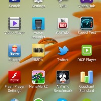
Running Quadrant returned a score of 5,596, AnTuTu spit out 10,440, NeNaMark 2 rendered at 49.2fps, and SunSpider 0.9.1 went by blazing quick at 1442ms. Vellamo meanwhile produced a score of 2,072. Turning on Power Saving mode will ramp back those benchmarks as the phone tries to conserve power, reducing the frequency of the active cores. Plug the phone in and you’ll actually see a boost in NeNaMark 2, with it hitting 60fps without any issues.

Multimedia also proved to be no issue for the quad-core processor and souped up GPU. We tested a handful of video files, including 1080p H.264 High Profile L4.1 video straight from a Blu-ray with a bitrate of 38Mbit/s, with the phone decoding the files with no issues whatsoever. The expandable storage plus MHL output means this is a capable little media center as well as a smartphone.
Camera
The megapixel count may not have been boosted, but is that such a problem? The Galaxy S II and Galaxy Note were both than capable of producing excellent photos, and it’s the same with the Galaxy S III. The eight megapixel images looks crisp, with strong detail and balanced colors. Samsung seems to be applying different processing to images depending on lighting scenarios, a wise move when blanket algorithms can often cause more harm than good. For the most part, any processing is conservative, with only very minor noise reduction and sharpening being applied to images.
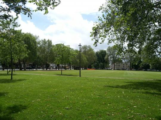
In other cases, it ramps back completely. Rather than destroy images in a blurry mess during low-light situations, Samsung has chosen to leave the noise in place. It’s a bold move, and we imagine some would complain about the artifacts, but depending on the scenario there can be detail to be had too. Why not leave it to the user to do additional filtering in that case? Samsung made the right decision here. Images aren’t held back by compression either, with pictures regularly coming between 2MB and 4.5MB in size. The only real complaint is for the camera’s tendency to overexpose images, but the HDR mode is in place should you need it. All in all, this is an excellent smartphone camera.
Similar praise can be extended to recorded video. While 720p makes use of the whole sensor, 1080p will only use the center portion, the same as on the Galaxy S II, Note, and iPhone 4S. Videos are recorded with H.264 with High Profile at L4.0, with bitrates coming in around 17-18Mbit/s. The frame rate is advertised as 29.97, and that holds true for the most part, although it is variable and can dip depending on lighting situations. Will we ever seen the day when frame rates really are held constant? Maybe, but the Galaxy S III unfortunately won’t be satisfying that particular desire. The biggest problem with the video recording is the focus hunting that happens a little too frequently for our tastes.
As for the camera application itself, you can quickly open it from the lock screen with a swipe up (as long as you don’t have a security lock enabled), presenting Samsung’s camera interface that you’re probably already familiar with. Some additional options have been added on the left side, such as Auto-Focus and a Mode select, but otherwise it’s the same old story. You can choose from a variety of modes including Single Shot, Burst Mode, HDR, and Panorama.
The shutter lag on the camera is virtually non existent: in fact, it’s even faster than the Galaxy Nexus. You can tap away to your heart’s content and the phone won’t miss a single click. Burst Mode also works as advertised, allowing you to select and save the best shot, and HDR processing is extremely quick – images come out well, assuming you can keep a steady hand or your subject isn’t moving.
Phone and Battery
Spoiler alert: this thing makes phone calls, and they sound rather good. Calls came through clearly, and while we had one or two dropped calls, we’re placing the blame on O2 UK’s network rather than the phone. The earpiece could stand be a little louder in busy environments, but that’s nitpicking, as it’s rare to make an actual phone call these days.
The speaker on the rear of the device is surprisingly loud, so much so that notifications and alerts woke us up numerous times while sleeping over the course of a week. That was with the volume set to a modest 50% too. The same can be said for the vibration motor, which is stronger and louder than average. Be that as it may, it still wasn’t powerful enough to overcome the Phantom Zone for smartphones: a jeans pocket.
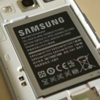
Samsung has opted to keep the removable battery on the Galaxy S III, a rarity these days as more and more smartphones seal their batteries internally. The 2,100mAh battery is the largest we’ve seen so far for a “regular” sized smartphone (sorry, Galaxy Note, you don’t count). At first, we were a little suspicious of the phone needing such capacity: was the quad-core processor and 4.8-inch 720p AMOLED screen going to be a killer combination? Turns out there’s nothing to worry about.
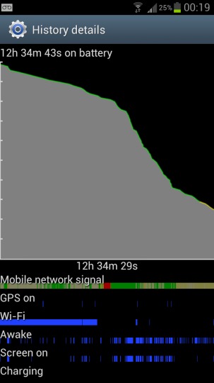
We had no trouble getting through a full day with plenty of battery to spare. That included text messages, WhatsApp, Twitter updates, two push email accounts, and the occasional lick of web browsing. What ultimately will decide battery life for you is the screen brightness setting. Samsung was conservative with the auto brightness for a reason, because left unchecked it can quickly suck away all the power from the device. If you set the screen to 100% brightness and leave it on most of the day, you’ll quickly run out of juice. If you’re more careful with the brightness and use the phone only when needed, you’ll have no trouble getting through a full day. We wouldn’t say you’d be able to squeeze into the next one, though, so you’re definitely going to have to leave this one charging overnight.
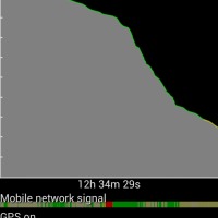
Taking things to the extreme, we ran a video rundown test. We took a H.264 1080p High Profile L4.1 clip with a 20Mbit/s bitrate and AC3 5.1 audio and played it on loop, with screen brightness set to 100%. WiFi, 3G, and Sync were all left on. After 5 hours and 4 minutes, the phone hit 5% battery life, warning us to plug it in and capping the screen brightness to its lowest setting, with no way to force it back up. Finally, after 5 hours and 26 minutes, the phone died completely.
Wrap-Up
Samsung had high expectations to live up to with this device, and while there was a sense of disappointment after the May event, using the handset should allay any lingering fears. Still, it’s hard not to feel short changed with the build of the device when you’re paying such a high price. Yes, it’s durable, and no, it won’t break so easily, but it’s the easy option from a manufacturing and business standpoint – that’s what makes it so disappointing. We’re not saying that Samsung should throw caution to the wind and go completely crazy, we just wish they would experiment with a more premium design and build in the future.
The question on everybody’s lips right now seems to be: the Galaxy S III or the HTC One X? It’s definitely a tricky one to answer. The HTC One X has a far superior build quality and industrial design, not to mention the best display on a smartphone right now. Having said that, the Galaxy S III does seem to offer the better experience overall, featuring a more tolerable user interface, faster performance, along with a whole host of features that power users will crave, such as a removable battery and expandable storage.
If both the phones were running stock Ice Cream Sandwich, then our choice would be the HTC One X. Unfortunately that’s not the case, and we have to recommend the phones for what they ship with and what they can do now, not what they might be able to run in the future via custom ROMs. In which case, it has to be the Galaxy S III for the better overall experience. It’s lightning fast, has a great camera, fantastic multimedia playback capabilities, and the best version of TouchWiz yet, even if that is faint praise. The only real sticking points are the design and size of the phone. If those aren’t issues for you, then feel free to hand over your money for this phone, because it’s arguably the best Android handset you can buy right now.
[device id=”2435″]







Any idea when you may review a US based version since it seems most if not all US models will not be quad core?
veddy soon
I never really understood why people like you want our phones to be a big heavy metal pos, plastic is perfect, it’s light, easily replaceable and better overall. Just another Samsung hater this guy is. Nokia could release a plastic phone but this guy would say it’s a premium built phone because it’s Nokia(Never have I thought Nokia phones are sexy) but Sammy makes plastic phones and they get critcized. Samsung phones are thee best looking Android phones around, so stop complaining about the materals used because Sammy is #1 and will stay there for a while so deal with it.
Didn’t he say the look of the phone, not exactly the material?
I agree with you! Plastic is the way to go. I don’t understand why people need to make these phones out of metal. It just needs to last me a year or two…that’s all! If I can change out the back cover when I am done with it and sell the phone, that’s all I need.
Plastic or not, the phone will still sit inside a case for most of the people
Grain of sold huh? ;P
Ahem. Fixed.
Why exactly would I want a super slippery hype-glazed back????
I want something that will *NOT* slip out of my hands and hit the floor.
Is this screen really THAT grainy and terrible:
http://cdn.androidcommunity,com/wp-content/uploads/2012/06/015-540×407.jpg
Or is this just yet another awful AndroidCommunity photo???
Updated with a slightly better photo. The tell tale PenTile signs are there if you’re looking for them. It’s the most tolerable out of all the PenTile screens, though.
The look and feel of a device is a big deal, but the more important issue is the user experience.
I’m sure it’s different for everyone…. but for me:
Look: 5%
Feel: 1%
Features: 94%
I’ve never really seen a “phone loaded with excellent features”… that was really that “ugly to look at”… or… “felt awful to hold in my hand”.
Look: 40%, Feel: 15%, Features: 45%
OMG. YES. PLEASE.
How old is the reviewer?
The reviewer or the guy who posted the comment? (Me)
Thanks for the review! This is my opinion:
I am in Mexico, I haven’t seen the phone nor played with it yet. However, the build quality has never been an issue for me. I always buy a top quality case for my phone and it always gives it a much better look. I mean, you are using the phone for calls and chatting and so on, the design won’t make any difference. Remember that video comparing an iPhone with a Galaxy SII on a drop test? The iPhone was severely damage on the test while the SII had virtually a few unnoticeable scratches. I prefer 1000 times a poor but durable build quality than a fancy but fragile build.
OS and Touch Wiz: The device you tested was a test unit or was it a device out for sell? I think you published that in the Samsung Event, users spotted a few flaws on the OS. I trust these were taken up and fixed in the units shipped out. We will be getting the SIII the 22nd of this month (a Samsung Rep told me after threatening her with death haha… joke). I am hoping those units will have a fully operational and flawless OS, I’ll be glad to let you know. Also, you’d be interested to know, the SIII we will be getting is the Quad Core LTE version. The most important carrier in Mexico will be launching its 4G LTE Network later this month or on July probably. I will also be glad to give you a review on how it runs on this network with a Quad Core processor on regards to battery life.
I can’t say really much about the SIII since I haven’t even seen it yet. But I’m so anxious to get it since I have a tendency to have my phones robbed (just got my Nexus robbed yesterday and my SII on March). Overall, I don’t care much about build quality and I’m pretty sure any flaws can be taken up and corrected in an update. I agree with you that everything should be working fine at the moment they launch it though.
And about the S-Voice… I really don’t mind. I have found out that users only use Siri and Iris (from Dexetra), only to show off their phones with friends but in real life they never use it. Further, you can’t really use them in Mexico because Siri is not yet available in Spanish. Same thing for Iris and I’m pretty sure it will be the same with S-voice. I don’t know how much Siri is used in UK or US, but few use it in Mexico, even with a very good English. Sometimes it did work when you told Iris or Vlingo to dial a contact as long as that contact exists in an English dictionary. Try telling Siri or other voice assistant to dial Quetzalcoatl… I guess you phone would shut down haha.
Thanks for the review! I’m pretty sure I will get it when my local carrier starts selling it.
I won’t really use S-Voice or Siri too, I can do much faster by myself than talking to it. I guess it is useful when you are driving, especially if there is a dedicated button on car wheel to activate it (Apple is working with some car manufacturer to implement it)
They couldn’t put a $2 camera button on the camera????
Wow.
What difference does it make to have a $2 camera button? Won’t give you better pictures. I mean… really, who gives a damn about the build quality on the camera shutter?
There was no mention of wireless charging inn this article
I don’t understand the problem, I don’t think that it feels cheap at all and the fact that it’s plastic and not ceramic or glass makes it for a much more resistant device…. If my galaxy s II was not plastic it would have shattered to pieces ages ago…
Also, in the case of the Galaxy S III vs the HTC One X it’s a no brainer for me for a very simple reason… Battery life!! Not only the HTC One X has worst battery life but it also doesn’t allow you to switch the batteries if you run out….Also I don’t like some of the modification to stock Android ICS like the recent apps interface…
“it’s rare to make an actual phone call these days”. I wish you would’ve led off with this; would have saved me the time reading through an utterly useless review.
The Samsung Galaxy I can trust. But this being England, I wouldn’t trust what’s on that plate. This is the UK, remember.
If the question is SGS3 vs HTC One X, the answer definitely is SGS3: With non-removable battery and no microSD-slot, the One X pretty much disqualified itself as a choice for me.
You could do with a proofreader.
I really love this phone..
HTC ONE X is the superior phone. super fast phone, awesome sharp bright display, camera and features are terrific, the battery life is great, lasts the entire day. most people dont care about the removable battery since most people dont need to remove it. i never did on my old htc g2. and 16gb ram is more than what most people need on a phone. you shouldnt store too much data on your phone anyway as it slows it down just like with a regular computer. back it up and clear out your harddrive!!
most importantly, in terms of product design, the ONE X just blows galaxy s3 out of the water!! ONE X is just far superior in build quality and design and is the cooler looking phone!! galaxy s3 is the ugly cheap stepsister to the glamorous cinderella that is the htc ONE X!!!
That awesome battery life that becomes less awesome eight months in to your two year contract. Also, while some people might not use 16 gigs of storage,there definitely are some that will. Having no option to upgrade your capacity is a major issue if you want to actually use your phone as a media device.
Not a terribly insightful review. Seemed like the reviewer got in the way of the information. See a Shrink, don’t waste our time.
i bought a samsung galaxy ace plus its nice
just as Ralph answered I am amazed that any one able to profit $8936 in a few weeks on the internet. did you see this website lazycash42.c()m
lazycash42.c()m
lazycash42.c()m
Looks like a pretty sleek lightweight phone. Wonder how it fares up against the old SII though. Can’t see much beating that for a while.
my co-worker’s sister made $14187 past week. she gets paid on the computer and moved in a $426000 condo. All she did was get fortunate and follow the clues explained on this website lazycash42.c()m
like Patrick explained I didn’t even know that a single mom able to get paid $9664 in one month on the internet. did you
look at this site link lazycash42.c()m
my short review: i have had the phone for 5 days. material is just fine. I don’t like the button placement because i frequently hit power and volume at same time (annoying). The physical button slows me down.. i could move so much faster if i could tap a touch-pad button in the center but because it requires some force, i have to shift my hand weight to the bottom (slows me down). The interface is mostly good but i was able to look up contacts and make calls faster on my HTC incredible (example, unlock to the phone pad, type on phone keypad the first few letters of someones name. Instead of seeing the long list of matches that i can scroll through, i see the first name only with a total count of other matches next to the name. Then i have to click the total count, there is 2-5 second delay!!! and then the full list finally comes up. Then i can scroll through and click a name. THEN instead of just dialing the default number, the next list of numbers comes up, and THEN i click one and i STILL have to click the green call button. UNBELIEVABLE. on the HTC, you type the first few letters, click the name in the long list and its calling. i cant take it!) Some other things (unmentioned here) about the interface are not as good as HTC Sense. But overall, i like most of the Samsung interface. The last point is the size.. i love the big beautiful screen but it might be just a couple of mm too big because i often lose it while i am shifting around to get to the top or bottom of the phone. If it were just a tiny bit smaller i would be able to easily one-hand-it. (note: i have average man hands.. and i am a man haha). the phone is great besides the things i mentioned. Maybe someone has some tips for me on the shortest way to look up a contact and call someone. it was so easy to do one handed with the HTC incredible.
I’m looking for a PMP, how much is this without a contract?
Owned This Phone A week Ago ::: GS3 Is Just <3 ,3
Its The World best Phone With super Technology ::: Lubbb Itt