The flexibility of Android and the continuing march of mobile technology progress are making Android available on hardware and price points that would have seemed impossible just a couple of years ago. The latest phone to skirt the line between smartphones and featurephones is the Samsung DoubleTime, a QWERTY phone with a novel hinged and double-screen design. For $50 on a new two-year contract it’s definitely on the low end of AT&T’s smartphone lineup, but can it stand up on its own? Let’s find out.
Hardware
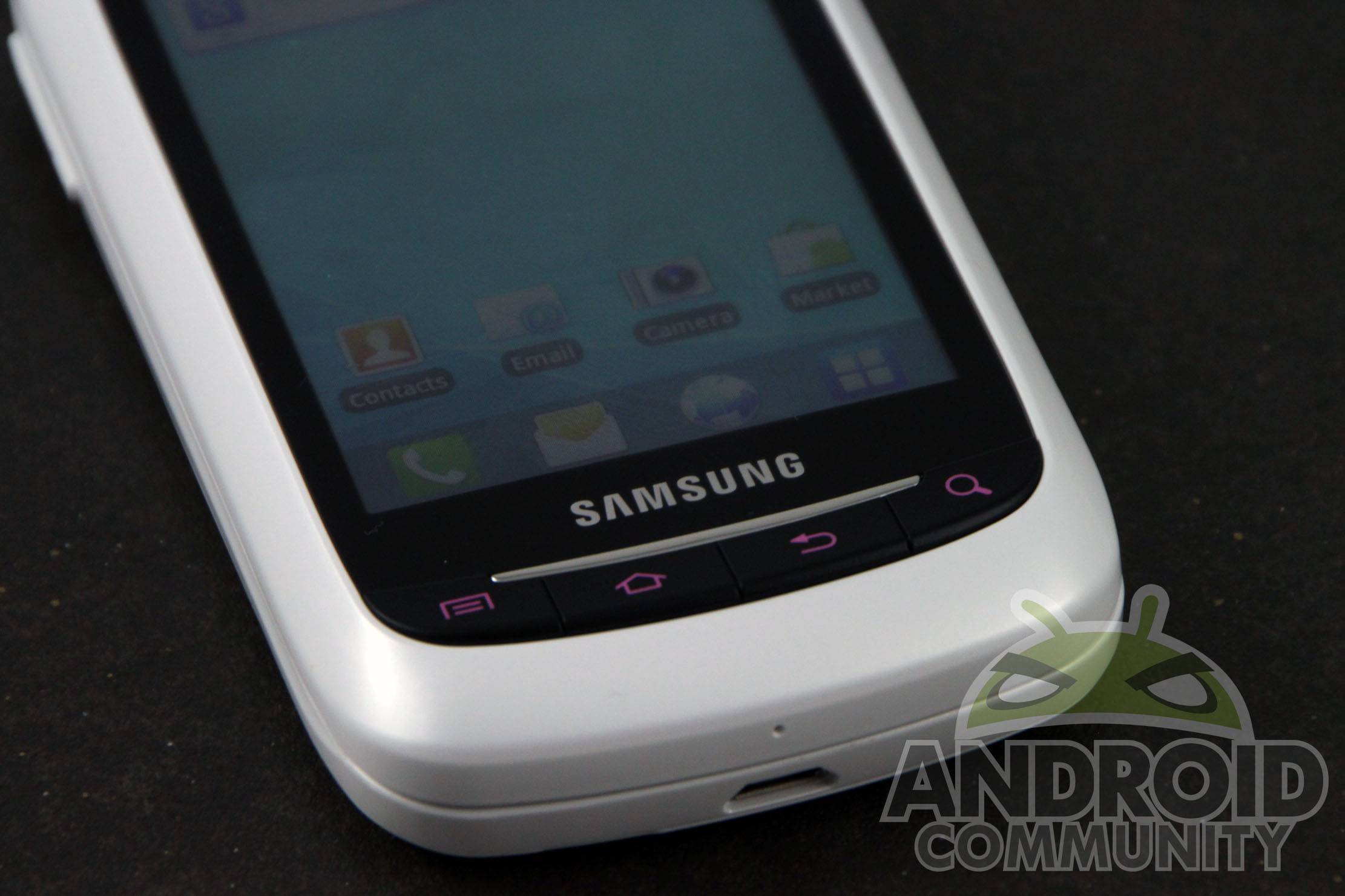
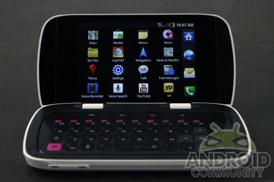
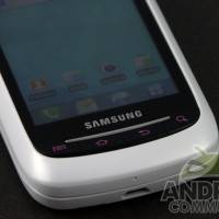
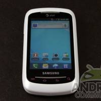
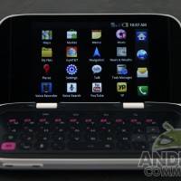
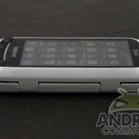
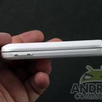
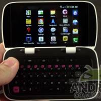
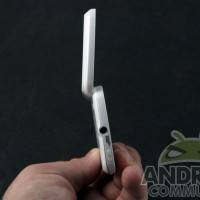
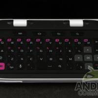
In fact the DoubleTime can literally stand up on its own, thanks to its horizontal clamshell design. In the fashion of “messaging” phones that have gone out of fashion as of late, the 3.2-inch screen flips up to reveal a second, identical LCD panel below, opposite the large and comfy QWERTY keyboard. 480 x 320 resolution isn’t anything to write home about, but on this screen size it’s as dense as is practical. Below the exterior screen you get pink-shaded physical nav buttons, which are repeated on the inside above the keyboard.
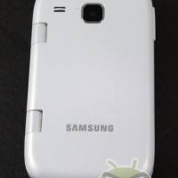
The phone is undeniably chunky for its width and height, but considering the keyboard and both screens that’s understandable. A phone like this can live and die on its hinge mechanism, and in that regard it does very well indeed: it snaps into place at about 130 and 160 degrees with a firm click, making it useful both as a speedy text-entry device and a desktop or nightstand display. The exterior is clad in eggshell white, and feels commendably sturdy.
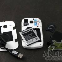
The DoubleTime’s specs, alas, leave a lot to be desired. It’s one of AT&T’s few new smartphones that only uses 3G, not the HSPA+ “4G” that they’re so keen on advertising. A 600 Mhz processor is pokey, even at this price point, and a mere 260 megabytes of user-accessible storage is downright frustrating, even with the included 2GB MicroSD card. A 3.2 megapixel camera is suitable only for low-quality snapshots in good lighting, and you’d better hope you’ve got good lighting, since an LED flash is painfully omitted. The primary draw for the hardware is the clamshell keyboard form factor – unfortunately, you’ll have to ignore just about everything else to consider the DoubleTime over its AT&T contemporaries at a similar or even lower price.
Software
The Samsung DoubleTime comes loaded with Android 2.2 Froyo. Let’s go over that again, just to make sure: the Samsung DoubleTime comes loaded with Android 2.2 Froyo. For the record, it’s been just shy of one year since Gingerbread became available, and similarly spec’d phones have had it almost as long. It’s possible that the DoubleTime’s low storage space prevented a later version of Android, but even if that’s true, another gigabyte or two surely wouldn’t have made this little phone too expensive. Given that Samsung and AT&T seem to think that Froyo is good enough for the moment, it’s my opinion that they won’t be interested in updating it. Ever.
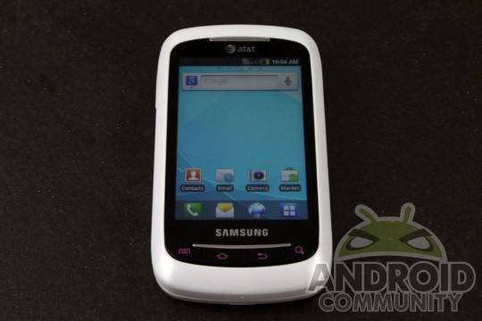
That said, the software is pretty solid as Froyo goes. There’s very little in the way of AT&T or Samsung add-ons, besides the now-ubiquitous account manager and AT&T Navigation. (That makes me laugh every time I see it.) IT’s possible that the phone’s low storage actually prevented it from being burdened with bloatware. The slimmed-down version of TouchWiz is snappy in both portrait and landscape modes, and Samsung’s customizations take advantage of the hardware to the fullest extent.
Calling and Texting
Call quality was in line with other AT&T phone in my area, though it dropped them on two occasions. This isn’t unusual for my home town. 3G speeds were reliable in urban areas. But if you’re interested in a phone at this price with a full keyboard, odds are you want to text, and text a lot. On that score the DoubleTime is hard to beat. Because the keyboard essentially takes up an area of space that’s the same at the entire height and width of the device, it’s nicely spaced with a full number row and D-pad. Firing off long texts or URLs was an easy and pleasurable experience, and thanks to the extra height enabled by the clamshell design, significantly more comfortable on my fingers than slider phones with their narrow keys.
Media and Battery
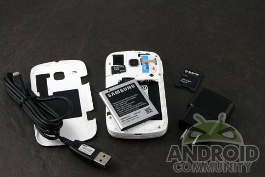
You’ll absolutely want a larger MicroSD card for music or photos. With that caveat, the DoubleTime works well enough as an MP3 player, with a surprisingly loud speaker for its small size. The built-in YouTube app ran well, though Flash video is a choppy and generally frustrating experience. Videos taken with the camera were smooth, but on a screen this small, it’s not much fun to watch them.
The battery is a small 1200mAh, but that’s rather typical on a phone this size. Keep in mind that only one screen is active at any given time, so the dual-screen design doesn’t hinder the battery at all. The DoubleTime lasted me all day even in a low-signal area – it’s probably getting some very efficient use out of Froyo, minimal bloatware and Samsung customizations. Users should have no issue getting through a tough workday without recharging.

Wrap-Up
As an Android fanboy, the choice to limit the DoubleTime with Froyo really, really gets on my nerves. But from the perspective of a first-time smartphone buyer, who just wants a phone with a great keyboard and decent call quality, with Android and app installation as an after thought, it’s a pretty good choice. Music fans and shutterbugs will want a bigger SD card, but excellent battery life means that this little phone is ready for lots of service in between charges.

The DoubleTime probably isn’t the phone for our most dedicated readers, but it’s worth considering for family members or friends who aren’t interested in Ice Cream Sandwich or massive screens. At $50 on contract it’s a little pricier than some other AT&T phones (most of which have better hardware) but that excellent keyboard makes it worth considering even so.
[device id=2055]





TO ANYONE READING THIS REVIEW: DO NOT BUY THIS PHONE! IT IS GARBAGE! YOU WILL BE DISAPPOINTED WITH THIS PURCHASE! IF YOU ARE FOOLISH ENOUGH TO BUY THIS THING, DO NOT BLAME ANDROID OR THE APP DEVELOPERS FOR YOUR BAD CHOICES! YOU HAVE BEEN WARNED!
Seriously though, this is a joke, right? This pile doesn’t even meet the specs of the original Droid. Considering the Droid is almost unusable unless it’s rooted and heavily tweaked (I had to overclock, optimiize the memory management, increase the sd read/write speed and drop in a swap file to keep mine even semi-smooth,) I don’t see this thing getting rave reviews.
Most worthwhile apps require too much in the way of resources to be functional on this thing. Unfortunately, typical users (you know, the ones who will get conned into buying this scrap bucket) don’t understand phone specs. If they see apps like Flash and Netflix in the Market, they’ll assume that they should run properly on their phone and blame the app developers if they don’t. This isn’t fair to the developers or the unfortunate end-user who got duped into buying this trash.
I understand the need for budget handsets on the market but as far as I’m concerned, releasing a “new” phone that has lesser specs than a phone that’s been discontinued is an insult to your customers and one of the main reasons people complain about their “buggy” Android experience.
The last time I saw the Droid for sale, it was $0.01 (and that was a while ago.) I don’t feel any phone with equal or lesser specs should be priced any higher than that.
nice blog , really enjoy it , keep it up
nice looking phone. I m too much satisfied of this phone’s specification
Is the inside screen touch enabled??
awesome phone getting it next year