Like many other features, stock Android has a notification and quick settings implementation that some love and some hate and some don’t even use at all due to manufacturers shipping their own version. If you are on the lookout for some alternative way or presentation for your most used settings, then Quick Control Panel might be something worth taking for a spin.
The vanilla Android version separates notifications and settings into two opposite sides of the top area, with notifications presented as a stack of items on the left and the settings as a customizable grid on the right. Some manufactures, like Samsung and its TouchWiz custom interface, merge the two into a single drop-down panel for convenience. Not everyone, however, has access to that kind of implementation and not everyone likes to mix their notifications with their quick settings but would still like to some more features and controls beyond what stock Android provides. If you fall into one of these groups, Quick Control Panel is a interesting option, that is, if you can get past the fact that it closely resembles the iOS 7 feature.
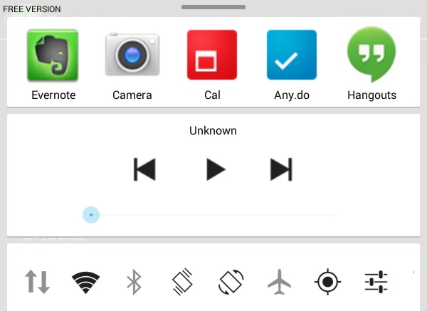
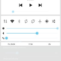
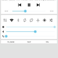
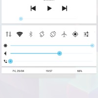
Quick Control Panel practically puts a settings toggles, quick launch icons, media player control, and volume sliders in one single panel the slides up when you swipe up from the bottom edge of the screen, pretty much like what iOS 7 does. The similarities, thankfully, end there, as the app’s developer made a conscious effort to try to stay away from that image. And indeed, the visual design leans more towards the Holo aesthetic, but the default black on white color scheme my convince you otherwise. Fortunately, those colors are completely customizable. Unfortunately, there is no easy way to change those, as there is no preset dark or light schemes. You’ll have to individually set each and every accent but at least the functionality is there.
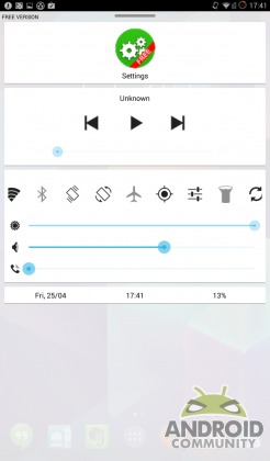
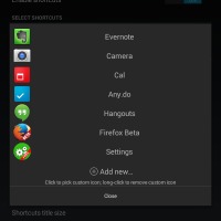
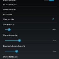
The panel is divided up into different sections. At the very top is the Shortcuts section which lets you put any number of apps for easy access. That feature alone already puts this app ahead of default implementations by Google or other manufacturers. One can add any icon, rearrange them according to your preference, and set the appearance of those icons, including icon size, borders, and backgrounds. This fine-grained control over visual elements is repeated all throughout the app.
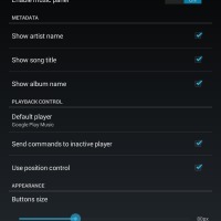
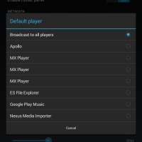
The music section comes up next, which is basically a music controller that is always present regardless of whether a music player is running or not. In fact, tapping on any of the controls causes whatever preferred music player you have set to start running. This behavior, as you might have guessed, is also configurable, and so is the choice of where to send the music player actions. Note that in some cases, the app might ask for permissions to read notifications, which was the case on CyanogenMod 11 but not on a stock Galaxy Note 3. Unfortunately, this feature seems to be a hit or miss depending on your setup.
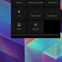
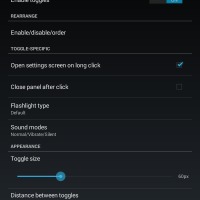
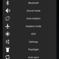
Next is the familiar quick settings Toggles section. Quick Control Panel imitates Samsung’s way of putting toggles into a scrollable horizontal row rather than an expanding grid. The choices of toggles are quite the same and you can opt to have them not shown, rearrange them, and dictate how big they are or far apart they are from each other. As with other implementations, a long tap on each toggle will bring up the appropriate settings page for it, but that too can be disabled. Immediately below it are three sliders for brightness, media volume and call notification volume, saving users a few taps when trying to quickly set the different volumes or intensities for each. As with the others, you can rearrange the order of these three sliders, but that’s about it when it comes to customization.
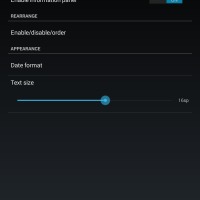
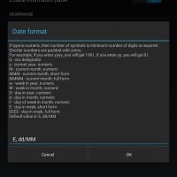
Last is the smallest of the bunch, the Information section which shows the date, time and battery status, which, of course, you can reorder and disable. Of the three, it is only the Date format that is customizable, letting users change the formatting of the text, in a rather arcane way that is more familiar to those who deal with lower level aspects of computers.
The Quick Control Panel itself is quite configurable aside from the color choices mentioned above. There are settings that control the trigger area, allowing users to set how high or how wide it is or even whether to use an upward, leftward, or rightward swiping gesture, which should give those allergic to iOS conventions a different choice. Unfortunately, the area will always be at the bottom, which is good since it won’t clash with notification panels that are situated at the top. You can also control the height of the panel but the width will always take up the entirety of the screen.
Wrap-up
Quick Control Panel is an interesting take on an aspect of Android that most of us probably take for granted. And, if you can get past that initial aversion to all things iOS, it can actually provide you with a fast, not to mention customizable, access to the settings all in one place, whenever or wherever you need them, even if an app is running in immersive, no notification bar mode. Unfortunately, that power does come at the slight price of ease of use, particularly when it comes to the settings. All the bells and whistles can make for a slightly confusing time and in some places, particularly the color selection, the geekiness of the app shows through. Simpler controls or well-chosen text or descriptions can go a long way to improving the user experience. Fortunately, the app is still young so improvement is definitely a possibility.
Quick Control Panel can be downloaded for free from Google Play Store via the link below. There is also a paid version of the app which, aside from getting rid of ads for good, also supports the developer’s efforts.
Download: Quick Control Panel (Free), (Paid)


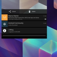


Q Slide on LG G2