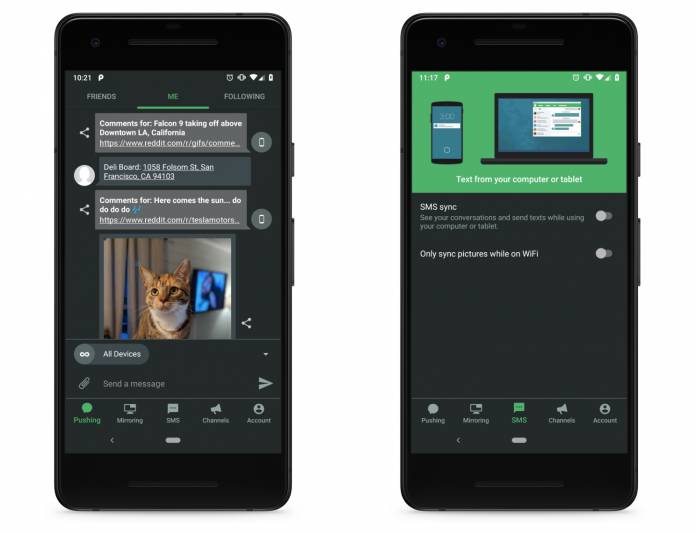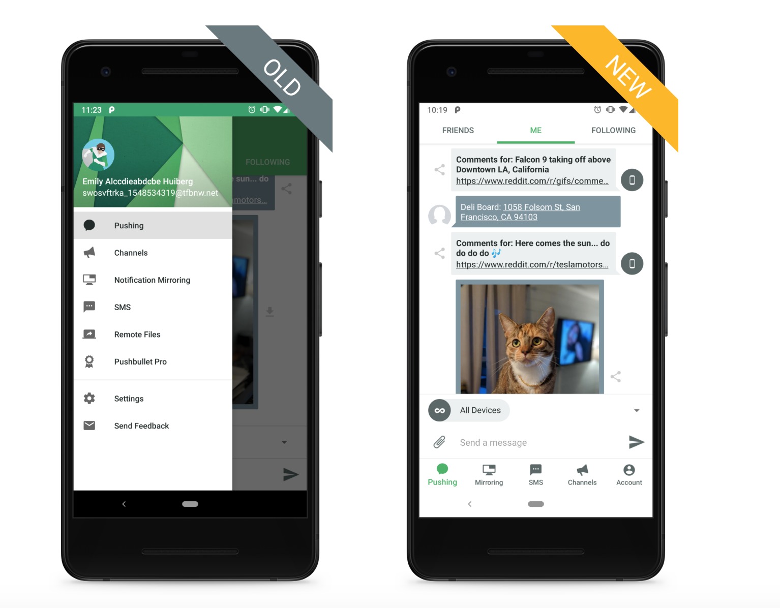
Pushbullet has been one of the best-reviewed and most popular apps on Android as it allows you to exchange SMs, links, and even files rom your Android smartphone and your PC. The latest update for its beta version, for those who want to check out features earlier than the stable version, includes an improved Material Design, an adaptive icon, and a dark mode option. This means the app looks better and you can also have a better experience with it in the dark.
When you open the updated beta version, the first thing you’ll notice and probably appreciate is that the you now have bottom tabs for navigation. Instead of hiding in the drawer, you now have Pushing, Mirroring, SMS, Channels, and Account tabs at the bottom of your screen, which makes it easier to access them whenever you want. But whenever your keyboard is open, the bottom tabs are hidden to avoid accidental clicks and to have more space for your keyboard and typing.

Your status bar and navigation bar colors will also now adapt to the color of your screen contents so your app definitely looks better and is now more “consistent and polished”. Speaking of adapting, the app icon is now an adaptive icon as well. This means your home screen icon can look consistent with the other apps there and you can also have custom shapes and effects.

Lastly, and most importantly for some, you now have the Dark Mode option. The bad news is that this is only for the Pusbhullet Pro users. This means you’ll have to pay $3.33/month to have the option to turn your screen dark during certain situations to save your eyes and your battery. The Pro version also has other benefits of course including bigger storage space, unlimited messages to send, etc.

The Pushbullet update is now available for beta users. As for the stable version, they only said it will be available “soon”.
SOURCE: Pushbullet


