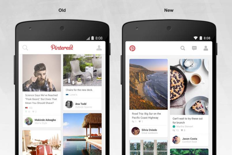
One of the most addictive things you can do on your mobile phone, aside from playing games or scrolling through your Twitter timeline, is browsing through a beautiful blackhole called Pinterest. You can’t stop pinning or hearting or just generally looking at visual pegs of things you want to do or stuff you want to buy someday. A new Android makeover for the app should help browsing easier and even more time-draining.
Improved navigation on the app sees the Pinterest logo, located before in the top middle part of your screen, now reduced to the P logo on the top left side. You can now see the search, message (a new-ish feature they introduced a few months back) and your own profile button at the top right corner, for easier access. The visual tweaks also makes it more “Android friendly” as well. But the more important update is that it has now reduced the time it takes to load the app and your pins. So yey, more pinning time!
While studies show that Pinterest has more traffic referral than other social media networks (yes, even Facebook), there is not much attention paid to major changes it makes, unlike when Facebook or Twitter does their updates. Maybe it’s because some are still not convinced that it is a viable source of e-commerce or even just traffic, even though it constantly outperforms Twitter. Or maybe because the changes it makes is not that drastic as to warrant coverage, and the changes they make are actually for the better and functional.
The update will slowly be rolling out to Android devices within the next few days. You can check if you already have it through Google Play Store.
SOURCE: Pinterest


